Image Overlap
Sykotica Preview Layouts


Your images are made semi-translucent by this layout. Take note. You can actually drag the image and see what's been cut off. Okay. So, start by breathing first. How do I go about explaining this? Okay, take a look at the layout in the layout marketplace with CONTENTID#'s. CONTENTID2 to CONTENTID4 are in the circular text areas. Just place an image between the corresponding start and end tag. Your image will be cut to fit the circle. It will not automatically resize. so if it's a huge picture, only a corner of the image will show in the circle and the rest will be hidden like magic. Here are the three images I used (The diameter of the circle div is 250px. I had to enlarge the small images to 250px because that is the minimum for nice round images. Larger images are fine. There is no maximum limit as everything else will be hidden with overflow:hidden).
|
CONTENTID2 featuring the wife's #1 Male Idol: Jaejoong
|
CONTENTID3 featuring the wife's #1 Female Idol: Xinling
|
and CONTENTID4 featuring the wife's #2 Male Idol: Junsu
|
A view of my text editor:
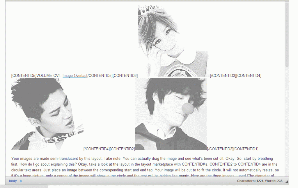
CONTENTID5 and CONTENTID1... treat it as you would normally do. I'm planning to have her change one of her layouts to this one, hence the examples.
Attention: If you are using this layout (and don't mind being an example), please link me to it. Thank you.
How to resize your image to 250px width or height
Double-click your image. This image properties interface will pop up. Find height and width. Which one is the smaller number? We will change the smaller of the two. If your width is the smaller number, you will change that number to 250 (leaving the height alone). If your height is the smaller number, you will change that number to 250 (leaving the width alone). See that lock sign in the red? Keep it locked. If it is unlocked, lock it.
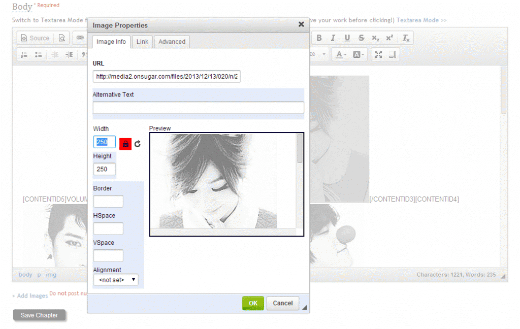
You can probably make your image width 250 and height 250 (with the locked sign unlocked). I highly discourage it though. I've seen so many people do that and warp the images... just to fit into a box and I'm like, hell no. I don't like seeing my images lacking obvious symmetry. His face is not in the shape of a squash, okay? Rant of the day.
(More advanced) Nudging (shifting) your image upward
Double-click your image. This image properties interface will pop up. Click on the tab "Advanced." It is the 3rd option after "Image Info" and "Link." Go down to Style. Leave whatever styles are already listed there like height, width, border, padding, etc. What you want to do is add another style. At the end of your list of styles, after the semi-colon (;), type in margin-top:-50px;
note, you must end it with a semi-colon like so and your number should have a minus sign (-) in front of it. You will change the number 50 to whatever margin you desire. The larger the number behind the minus sign (-), the more it will be nudged upward. Test a number out. Click the "OK" button and "save." View your foreword or chapter and see how much more you need to nudge it or un-nudge it.
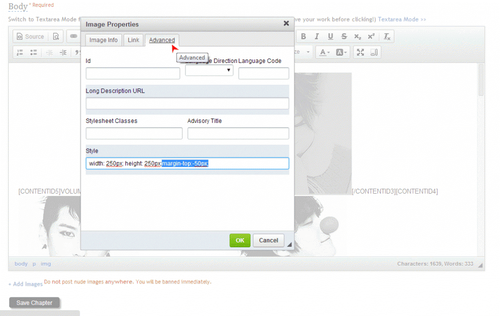
You may also nudge it to the right or to the left with margin-right:-#; and margin-left:-#; but it is not recommended. Negative horizontal shift varies and may be unpredictable. There may be a way to use positive horizontal shifts but that will take a lot more explaining. No thank you.
Layout Reference: N/A
Comments