calling misfits
Awkward Tokki ✦ Reviews Shop | closed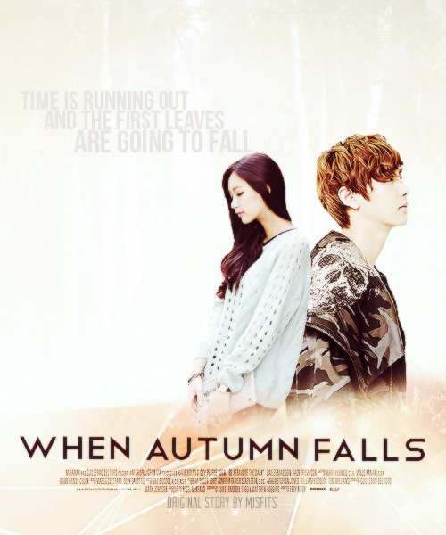
Designer: misfits
Genre: Romance, sad, melodrama
Reviewer: baekyeols
First Impression {9/10}:
A really relaxed and light feeling, although it looks a bit empty
Mood/Theme {8/10}:
I think you reached the romance theme but I really don't feel the ‘sad’ in the poster. If you desaturated the whole poster and add only a bit of color it would have made it romantic and sad at the same time.
Composition {7/10}:
To be honest I didn't like how the characters were all the way to the side while the quote/words took up a lot of space. Maybe it’s just your way of designing, but I think if the characters were moved up and the quote moved down it would look better. There is too much empty space at the top so by moving the characters up it reduces the space. Either that or you can crop the top off and leave the rest. Another way to look at this is to move the title to the top and move the quote to where the title originally was.
Comments