calling ProximaC
Awkward Tokki ✦ Reviews Shop | closed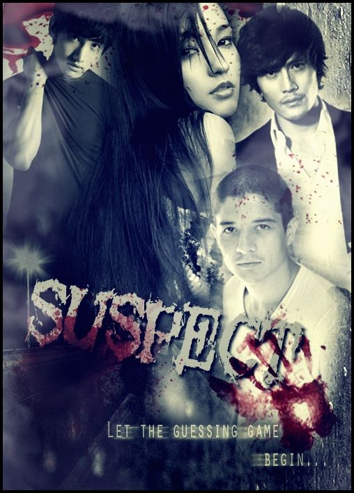
Designer: ProximaC
Genre: Dark, Mystery, Thriller
Reviewer: baekyeols
First Impression {6/10}:
The poster looked a bit messy and something seemed off about the poster.
Mood/Theme {6/10}:
The poster has a dark mood which suits the theme perfectly. There are just some factors that didnt match the theme perfectly, which will be mentioned later.
Composition {4/10}:
I think the composition of the pictures was the problem; it made the poster look messy. When I first saw it, the placing of the characters made me feel really uncomfortable, since the bottom half is empty while the top half is cramped. The girl took up most of the poster so I guess she is the main character but it made Changmin look really squashed up in the corner. The guy to the middle-right is just there, while everyone is at the top of the poster. I think it would be better if you moved the guy up and resize all the characters so they fit. Either that or move one of the characters from the top so it evens out. The quote is off to t
Comments