▬it's yours❞┇proximaC
▬it's yours❞┇graphic reviews┇not accepting
It's Yours {graphic reviews
by jinjinjin and rxsberry
for proximaC
+first impression; 15'20
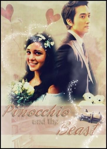
the posterlooks a little low quality, but you blended it right. the fonts aren't much eye-catching either. it almost seems like this was edited in instagram. the pictures are also low quality, but the effects you put around them were cool.
+color usage ( remember it depends on the theme ); 13'15
the theme matches the poster well. the color also compliments the sweetness of this poster. though it would be better if the color of your border wasn't black, but pink or any light colors that would compliment the poster more.
+picture usage; 12'15
as i said earlier, the pictures you used are low quality, but you blended quite well. though this poster seems edited from instagram, it has an effect that seems vintage, and you're lucky because vintage matches the simple, sweet theme. i would like it if you used much more high quality pictures. you can also sharpen them to make them look more hq.
+typography; 22'25
also the fonts seem a little dull. they just have one color, and they also look low quality. the effects you put enhances it though. other than that, there's nothing wrong.
+attractivity; 23'25
even if it's low quality, it looks warm-hearting because of its vintage-ness.
+overall; 85'100
jinjinjin says:
i'm sorry for updating really late. i hope you improve well. thank you for requesting for a review, fighting!
Comments