▬it's yours❞┇gongjyuu
▬it's yours❞┇graphic reviews┇not accepting
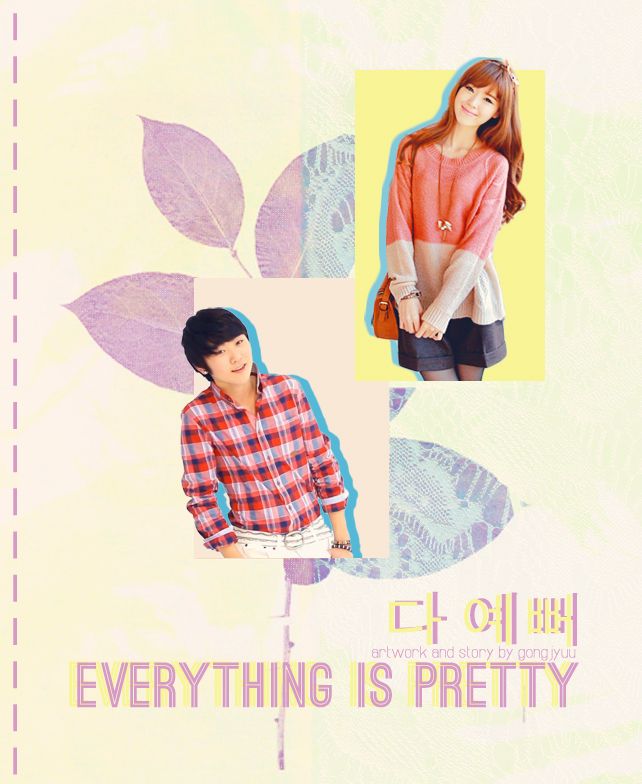
It's Yours {graphic reviews
by jinjinjin
for gongjyuu
+first impression; 14'20
its okay but the background of the characters pictures should be of a color that goes well with each other. yellow and beidge.
+color usage ( remember it depends on the theme ); 10'15
mm as mentioned above you should use colors that go well together. it doesn't look that good when the two backgrounds don't mix. but the theme and main color is great and there's nothing obviously wrong.
+picture usage; 12'15
great choice of the pictures but i think you should make the characters bigger so that it would take more space. It doesn't look that good when the characters are small. maybe a teensy bit bigger would be great.
+typography; 21'25
its great. although i think you should use different fonts as its a fluff and sweet poster. it would look better with a mix of fonts!
+attractivity; 20'25
it attracts many people and i'm sure you'll improve (:
+overall; 77/100
Oh and by the way this is xhiimee reviewing this (:
xhiimee says:
hello ~~ This is xhiimee! nice job with the poster (: I know I'm not as good as other designers but i hope you'll take note of the colors! Goodluck! FIGHTING.
Comments