▬it's yours❞┇Lydine
▬it's yours❞┇graphic reviews┇not accepting
It's Yours {graphic reviews
by jinjinjin
for Lydine
+first impression; 16'20
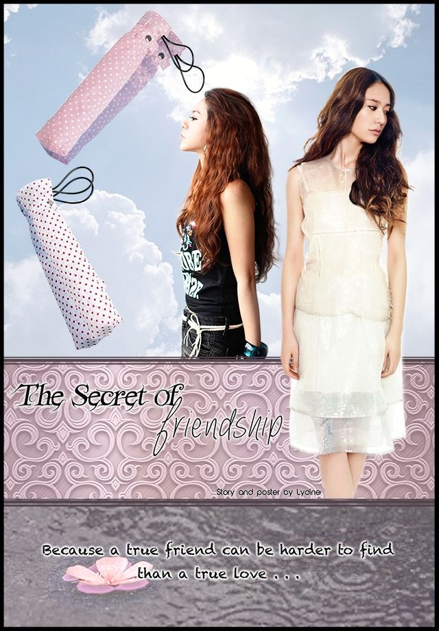
the first thing i noticed were the two white and pink things floating. are those the umbrella's case? and this poster kind of reminds me of the century past lol the clouds are pretty effects. the font is a little plain, but good job on having more than one font. black and white colors aren't my style, sorry.
+color usage ( remember it depends on the theme ); 13'15
black isn't supposed to be light romance, hon. but the other colors were fine, but not black, sorry.
+picture usage; 12'15
i take it that the girl with the white dress ( krystal? ) isn't rendered well? i hope she is. i recommend you put a or an outer glow for her, as well as the girl wearing black. i'm not a fan of the umbrellas, too. the others were fine. i was a little weirded out with the pattern of the text's box though.
+typography; 21'25
black isn't a great color for the fonts, as well as the border outside the poster. the fonts were good though. i just hope you can change the colors. the 'friendship''s font wasn't pretty though. i recommend other cursive fonts for it.
+attractivity; 22'25
i wasn't really wow-ed, but this poster was worth it.
+overall; 84'100
jinjinjin says:
i wasn't much of a help, wasn't i? i still hope i can help you improve in the future though. fighting!
Comments