▬it's yours❞┇ing
▬it's yours❞┇graphic reviews┇not accepting
It's Yours {graphic reviews
by jinjinjin
for ing
+first impression; 17'20
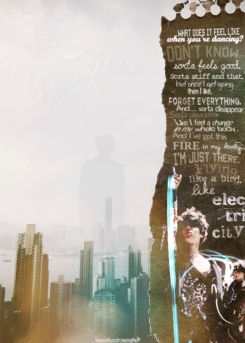
the first thing i noticed were the quotes at the right side. wow kai and the quote really click. it's sort of very long, and i get lazy to read it all, so i suggest you just shorten it. but i like how it's ripped and the fonts are different every time. to be honest, the first time i waited for the title to show, i didn't get to read it clearly. but after watching it for a few more times, i finally realized it's 'be amazing'. that's another problem. other than that, i liked the gif.
+color usage ( remember it depends on the theme ); 15'15
i liked how kai and the colors mixed, even though there's no specific theme. neither i, can distinguish the theme, but it's like the touching type? lol
+picture usage; 14'15
i liked the gif of kai, and there wasn't anything wrong with the two other pictures on the lower right side. it's from light saber, correct? i didn't have a problem with the torn page, and the other textures you used. i liked how the yellow and blue colors mixed in the building, good job.
+typography; 23'25
once again, the quotes at the right side, they're a bit long to read, and as you know, there are more lazy people than hard-working people, and i'm one of them. i wasn't much energized to read all of it, i suggest you shorten it. i liked the fonts, nonetheless. i didn't get to read the title too much, but after reading it for how many times, i realized it's 'be amazing'. and i have a suggestion -though i know the main point here is the quote- i think it would look good if you cut the words- i mean, it's torn and such, so the words have to be cut, too, right? but i know the main point here is the quote, so i don't bother to change it. it was just a suggestion, if the main point here is kai. i suggest you change the font of title, i couldn't see it. but other than that, nothing was wrong.
+attractivity; 23'25
the poster's lovely, dear. good job.
+overall; 92'100
jinjinjin says:
i hope i could help, little one. i hope to see you get 100! fighting!
Comments