▬it's yours❞┇greasyinspirit
▬it's yours❞┇graphic reviews┇not accepting
It's Yours {graphic reviews
by jinjinjin
for greasyinspirit
+first impression; 17'20
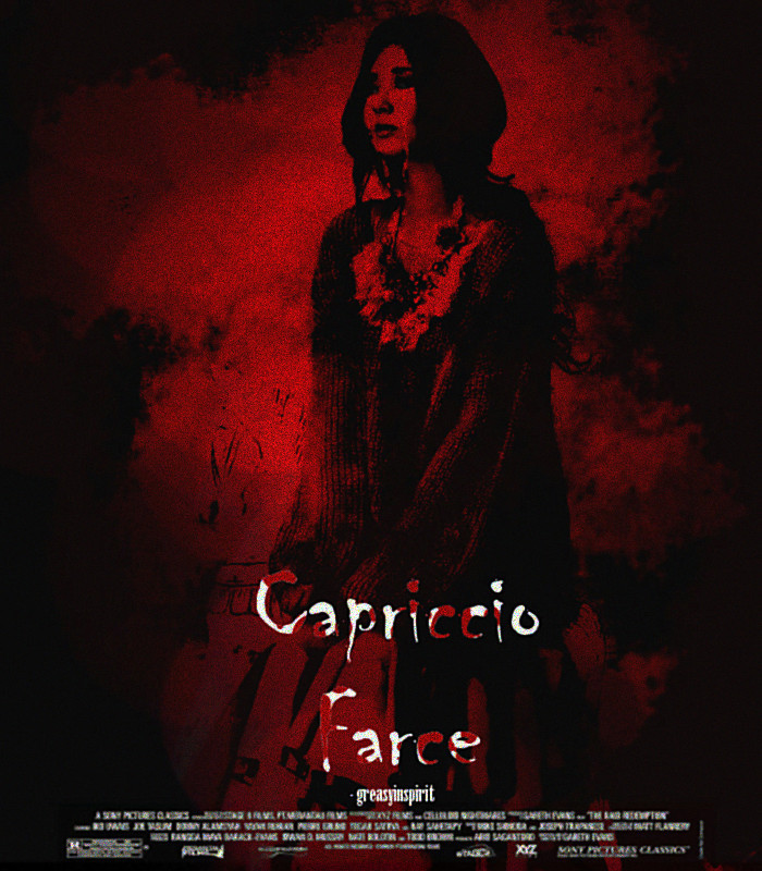
the first thing i noticed in this poster was the title. it was quite unique for a title, to be honest. okay, back to the point... 'capriccio' and 'farce' had a large space between them. and the credits... why don't you rise it up a bit?
+color usage ( remember it depends on the theme ); 15'15
nice color for a horror themed poster!
+picture usage; 13'15
i understand your credits are blurry... here. set it to multiply or lighten or screen. i also notice little, but many dots on her face, and it's not a pretty thing to look at, tbh. but the effects around her are pretty.
+typography; 21'25
once again, i think they have a large space between them. why don't you lessen it a bit? and the font... it's okay, but i'm suggesting you to use another font.
+attractivity; 21'25
your poster is pretty. great job.
+overall; 87'100
jinjinjin says:
i hope i helped with the credits. if you don't like it, just search 'movie credits psd' in Google. fighting!
Comments