▬it's yours❞┇wu-xi-zhang
▬it's yours❞┇graphic reviews┇not accepting
It's Yours {graphic reviews
by jinjinjin
for wu-xi-zhang
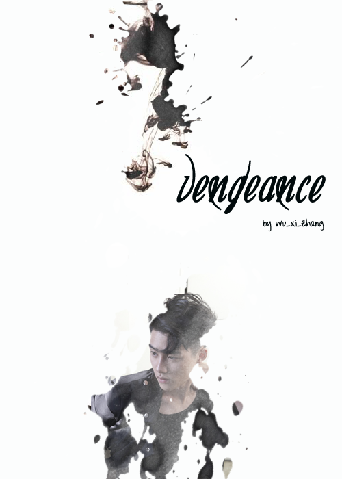
+first impression; 16'20
first of all, i think the poster's really empty, but the splats you put were amazing. there isn't anything majorly wrong.
+color usage ( remember it depends on the theme ); 13'15
i know this is angst-themed, and white is good, but i think the white color is a little too much.
+picture usage; 13'15
there isn't anything wrong with the pictures, though i suggest you make kyungsoo's picture bigger so that it'll take up space in your poster. maybe it'll look a little better if you made it bigger. and no offense, but the splat you put at the top, what is it? i mean, you could've put another picture of him and make it bigger, but if it's for effect, why is it at the top? i mean, if you put it there, why don't you add more different splats around, so they could take up the space?
+typography; 22'25
i wasn't much -for the umpteenth time- wow-ed with the font of the title, and it could've had an effect. the outer glow effect, and it could've been a better font. other cursive fonts. search in dafonts.com, it's a good place for fonts.
+attractivity; 22'25
even if it's empty, i know you'll improve. i can see it, and good job on this poster.
+overall; 86'100
jinjinjin says:
i know it. you'll improve. i suggest you get a review from others, and compile the suggestions made, so that you'll get different tips. fighting!
Comments