▬it's yours❞┇chubbunny
▬it's yours❞┇graphic reviews┇not accepting
It's Yours {graphic reviews
by jinjinjin
for chubbunny
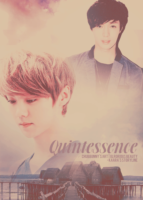
+first impression; 17'20
on my first look i think your poster is good! i have a problem with the color of the font though. it's a bit empty also.
+color usage ( remember it depends on the theme ); 15'15
the colors you chose for this poster is beautiful! well done.
+picture usage; 11'15
i examined the photo you used for luhan. it was a little low quality, and i think the size of his head is too big. why don't you make it smaller and match it with lay's size? from the previous reviews, i said that it's much prettier if you compare their photos and make their heads be the same size. other than that, your blending was really good!
+typography; 22'25
your font is really good! it matches the theme and color. i have an advice to give again though. why don't you style the title a bit? i mean, put some outer glow on it or just experiment and do something you haven't done before? it's good to go though.
+attractivity; 24'25
the poster is beautiful. keep it up, hon.
+overall; 89'100
jinjinjin says:
good job, hubby. keep it up. only one point and you should have been 90! improve more, and take in my tips. fighting!
Comments