▬it's yours❞┇chubbunny
▬it's yours❞┇graphic reviews┇not accepting
It's Yours {graphic reviews
by jinjinjin
for chubbunny
+first impression; 16'20
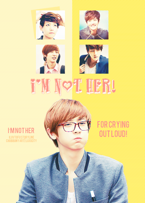
the first thing i noticed were the boxes. i'm not quite... amazed with them. and i have an advice. if you put a shadow on baekhyun's first box, put another shadow on the second box, so they're going to be fair. do you get what i mean? and the typography is pretty for a cute themed poster. it's just a little little, you know? the poster looks a little empty, too.
+color usage ( remember it depends on the theme ); 15'15
good choice of colors. it matches the theme!
+picture usage; 1215
i like chanyeol's picture. he looks cute my only problem with it, is the emptiness of the picture. why don't you put a shadow or for him? it would have been cute like this ( the shadow of the girl ) it has two colors right? why don't you use yellow for the peach part, and peach for the yellow part? simply like that. and the boxes... i'm not really sure about that.
+typography; 22'25
the font for the title is cute! good job for that! i have another problem though... ( forgive me lol ) one font for the quote and credit...? no no, hon. it should have been a better font, and the other part of the quote on the right side... can you put them a little closer so that there's no big space?
+attractivity; 21'25
cute poster!
+overall; 86100
jinjinjin says:
i hope i could help. i had so many to complain about~ sorry, and fighting for you future works!
Comments