▬it's yours❞┇proximaC
▬it's yours❞┇graphic reviews┇not accepting
It's Yours {graphic reviews
by jinjinjin
for proximaC
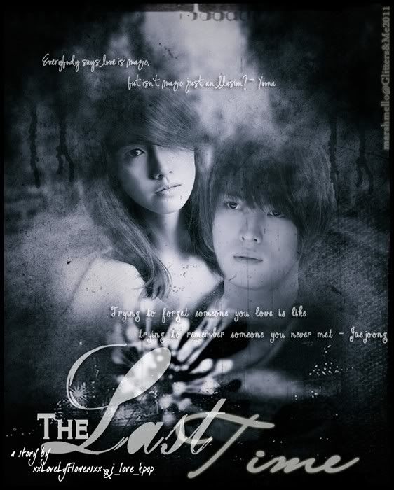
+first impression; 15'20
the first thing i noticed were the fonts. i wasn't much of a big fan of them, especially the quotes. it'd be a miracle if you'd understand them. the poster is a little low quality, but i like the smoke from the poster.
+color usage ( remember it depends on the theme ); 15'15
the colors are great! it's angst, after all.
+picture usage; 13'15
the pictures weren't much high quality. it'd improve if you used high quality pictures and sharpened them. the other textures were good, so good job!
+typography; 20'25
the fonts, especially the title's fonts, are a little too big and unpretty, don't you think? i think it'd be better if it's another font. the quote's font isn't readable, to be honest. i didn't like it. i hope you use something readable and simple, but beautiful next time.
+attractivity; 21'25
this angst poster seems cool, though. good job.
+overall; 84'100
jinjinjin says:
jinjinjin's sources will be up soon, so i could help you guys better. thank you for requesting a review. fighting!
Comments