BabyCopGurl
Graphic Review Archive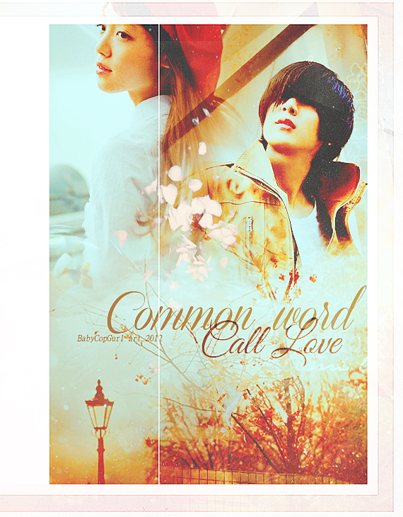
First Impressions: [8.5/10]
at first glance what i thought (sometimes unedited thoughts
and how my mind works when i first look)
first thoughts when receiving review request, "gave up on designing my a ss."
lol ok first thoughts when seeing poster, "good contrast and nice color theme"
blending is good no harsh edges and weird backgrounds.
gave me a positive impression.
Technique: [18.5/20]
how masterful are you at blending/cutting
blending is good. however there are some spots that look awkward to me.
not sure if that's due to the texture on top of it or maybe you added some spots
of white behind the text or something else.
but the area behind the text, is distinctively lighter than the rest of the area.
so if you take a step back, you can see a drastic change in color.
yes it makes the type easier to read but that could have been achieved
by making the area smaller as well, and also having a subtle outer glow.
Resources: [17/20]
does your images/stocks/brushes/textures enhance the poster
the image of the girl is good. i dont like the image of the guy.
he gots no eyes. I dont know if thats due to over processing or not.
the position of their bodies are good. they add visual appeal
(compared to two people standing straight)
images are chosen well for that reason.
The stock is suitable, it matches your color theme well.
The border is nice however I find the left side strange,
since there is so much extra space. it seems to be a part
of the texture that was screened on top but cropping the piece
would have rectified this issue. also the white line going down
the piece is very distracting. it might have been ok if it was softlighted,
but to me it seems like it was part of the border and went along with the screen mode.
the white stuff, are they petals? the one in between the two characters.
it seems like it was added it near the end since the color doesn't really match.
it doesn't have the right undertones to the poster.
As of now, they stand out too much and would be better without it.
even if they were to match in color, it still doesn't seem necessary,
a sparse couple of them would be a nice touch, but since there was a large
concentration of it, they take up too much attention
seems more like it was put either to fill up space or hide something.
i dont like the diagonal stripe in between the two characters.
besides being one the darkest elements in the piece,
since the guy is looking up it brings even more attention to it .
also it might be the particular textures used, but near the diagonal,
there are many sharp angles that seem to come to a point
above the guy's head. i would have liked to blur that away.
same goes with the flower that was from the texture,
to the left of the guy's head.
Please Subscribe to read the full chapter

Comments