HwangAhYoung
Graphic Review Archive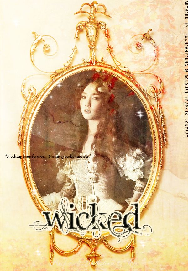
First Impressions: [6/10]
at first glance what i thought (sometimes unedited thoughts
and how my mind works when i first look)
mmm ok this is not for a story. nice idea with the use of the frame.
the colors are just kind of ehh to me. they dont stand out much
since they are all basically in the same family.
its not a bad piece, its just does amaze me.
Technique: [20/20]
how masterful are you at blending/cutting
ok well everything looks good here since
not a lot of blended was needed.
cant comment much.
Resources: [13/20]
does your images/stocks/brushes/textures enhance the poster
i like the idea of the frame/mirror whatever it is.
but notice how much "extra" stuff there is on the top?
i feel like its a waste cause nothing can go on top of that spot.
i think using a different frame would be better
just so that youll have more options with the space around it.
maybe something less ornate.
i like the leaves or whatever is in the background on the top right especially.
i do not like that sparkles at all.
i think its a mismatch in mood.
to me sparkes = magical/happy/cheerful
not wicked/evil
i would have liked to see additional resources.
not textures, but i think stocks would have greatly helped your piece.
adding some in the background to further "frame" your focus.
Composition: [18/20]
did you create an eye catching and balanced piece
how well does your piece "flow"
the main composition of the piece is simple and
easy to understand (which is not a bad thing).
i would have liked to see some more negative space.
for example: making the frame+ image smaller.
therefore youll have more room to play with text and possibly adding stocks.
i do not like the text placements.
they are hard for me to read.

Comments