bixii_

Graphic Review Archive
Please Subscribe to read the full chapter


First Impressions: [8/10]
at first glance what i thought (sometimes unedited thoughts
and how my mind works when i first look)
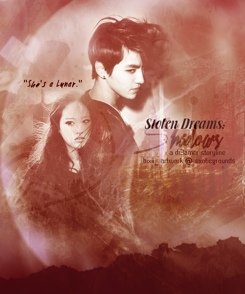
the poster is not bad. its pleasant to look at.
because its monochromatic its a bit flat
and could use a little kick to add some spark into it.
i would increase the contrast with curves / levels.
or duplicate a new layer, desaturate and set to softlight.
 

Technique: [17/20]
how masterful are you at blending/cutting
the blending is pretty good. the only part that really bothers me is the girls head.
on her face i can see the guy's body and other stuff.
it's distracting to see a face covered or looking dirty, 
so do a double check to make sure there are no extra parts that need erasing over the faces.
the rest is blended pretty well. i like how the circular moon shape is included
 

Resources: [15/20]
does your images/stocks/brushes/textures enhance the poster
the images used are good. a pet peeve of mine is to try to have them as close as possible.
example, i like matching skintones and sharpness. 
they match pretty well on this poster.
like i mentioned before, i like the inclusion of the moon looking circle as it relates to the story.
but i would try to keep it as circular and possible.
there are some spots sticking out on the left that make it look sort of not like a moon.
the part that needs some work to me is the other stock usage.
for example, behind the text there are some stocks there, 
but i cant make out what they even are.
was it used to fill up space? 
i think it would be more meaningful if the stocks you pick would be seen
and enhance the message the poster is telling.
also the stocks behind the text makes the text harder to read.
i would blur it out a bit where its overlapping the text.
is that paper rip on the bottom? its a nice touch.
but because its sort of light in color, it sort of looks out of place.
consider making it in white since the poster will be on a white background on aff
then it would feel more like the poster has ripped edges.
another thing that might help is adding a dark border and making the rip darker.
either way go dark or go light but not this in between for this case.
 

Composition: [19/20]

Please Subscribe to read the full chapter

Like this story? Give it an Upvote!
Thank you!
vanessax17
sorry ive sort of neglected this ahaha but it takes me at least a solid hour to do one! and i dont like starting and stopping so i need to find some down time

Comments

You must be logged in to comment
BunniesOnTheMoon
#1
Chapter 50: Sorry for the late comment bb! Thank you for the review! I wasn't too sure on this one, and I started doubting myself after I sent it in, but I guess I should be more confident because you thought it was interesting ^^
I do admit I oversharpenined this a bit more than I should XD The pictures used were fuzzy after I resized and I overcompensated by sharpening too much OTL
<3
SapphireQueen #2
Chapter 41: oh no :c
you are my favorite reviewer <3
well, always supporting :D
Stargawn #3
Chapter 41: Nooooo!! :"( that makes me really sad. I really liked the way you reviewed. I think you're the best reviewer I know here and you're one of my favorite designers too ^_^
Oh well...it's understandable. I wish you good luck with your other things=]
ChibiMusicStar
#4
Chapter 41: awww too bad >.<
Your reviews are awesome and you are one of my fav designer + reviewer. Good luck in your studies and graphic skills :D
vanivici #5
Chapter 41: Awww too bad!
I really like your way reviewing a poster. C:
Andd you're one of my fav designer , and i think you are the best reviewer out there! XDD hahaha
Goodluck for your another things then! <3
teaquiIa #6
would you like to be an affies? c:
a graphic review shop, `( gleaming sunset; www.asianfanfics.com/story/view/243077
CoolerThanYou #7
Poster Link : http://i4.minus.com/ixFyisXJUkTnT.jpg
theme/mood : angst, mistery
story link : http://www.asianfanfics.com/story/view/406486/his-dark-side-originalcharacter-exo-kai
any difficulties : I have problems on choosing fonts. I hope you can help me on that :D
Program used : photoshop cs5
Any other comment : Thank you :D
ChibiMusicStar
#8
poster link:http://i.imgur.com/gvvu9cX.png
theme/mood of story:romcance and sad
story link: n/a
what you hoped to achieve / any difficulties:
Hmm i overuse blending at Jessica and the stock was kinda blurred right? So basically i want to try something new and fresh. Ohh i have problem with the placement of stocks and fonts :D
program used: Gimp :D
any other comments: Vanessa is the coolest XD
Soshiss
#9
poster link:
theme/mood of story:
story link: http://www.asianfanfics.com/story/view/387184/loveplayer-you-exo-exom-luhan
what you hoped to achieve / any difficulties: i hope to archieve is to blend some colors together with the used of textures (: Diffulties? Hard to find a suitable texture.
program used: Gimp...
any other comments: nope