creamysmiles
Graphic Review Archive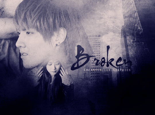
First Impressions: [6/10]
at first glance what i thought (sometimes unedited thoughts
and how my mind works when i first look)
my first thought was "wow its tiny. i need to zoom in to see this."
then i noticed the colors in the piece which is good.
but then i saw the girl. she looks like she's coming out of his neck.
i think thats a little strange. even the guy's facial expression looks like
he's a bit uncomfortable with her being in his neck.
lastly, i liked the font.
Technique: [17/20]
how masterful are you at blending/cutting
blending seems good.
between the guy and the building is nice. between the guy and the girl is good.
i think her hood got too lost though. theres a lot of empty space where it should be.
that probably contributed to her being a part of his neck look,
because she doesnt exactly "end" anywhere visually.
Resources: [16.5/20]
does your images/stocks/brushes/textures enhance the poster
images are good. quality is good. texture used is good.
i like the paper-iness of it. i think you could experiment with colors and more textures though.
sad posters need not be monochromatic. just a little but more colors can go a long way.
heres an example of a poster thats has more colors but still dark and angst
credits lorena
i like that you added a stock, but using it just to fill space is not its sole purpose.
stocks should enhance the poster and give the message you want to convey more meaning.
so if i apply this concept to yours, i would say, "what do buildings have to do with being broken?"
nothing obvious. i think a different choice of stocks would have been a good choice,
like broken glass, broken mirrors, or anything on the concept of fragmentation.
these are good examples of how other designers incorporated this idea into their posters:
credits raini
credits wildsheepz
Composition: [12/20]
di

Comments