creamysmiles

Graphic Review Archive
Please Subscribe to read the full chapter


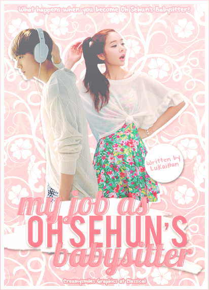
First Impressions: [9/10]
at first glance what i thought (sometimes unedited thoughts
and how my mind works when i first look)
my first impressions of this poster is pretty positive.
its a nice cute simple poster. it looks good but is too light for me.
there arent any dark dark colors in the piece which i think its missing.
their hair for example, where there is suppose to be black for the shadows, its greyed out.
i think it could use some contrast (ex curves) just a bit to get more shadows on their faces and etc.
 

Technique: [20/20]
how masterful are you at blending/cutting
the cutting is very good. its pretty near perfect for the characters. 
all the cuts are smooth and sharp.
cant really go into depth about it lol.
another thing that is sort of related, the white bit behind the title, 
to me its suppose to be like a marker or brush ? 
so the drop shadow behind it makes the bottom look blurry.
i would say either sharpening that up (using brightness and contrast maybe) 
 

Resources: [14/20]
does your images/stocks/brushes/textures enhance the poster
the images themselves are good and suitable.
quality is good. i think here is where you could have added more to make the poster really shine.
like choosing stocks and other items that relate to the story.
maybe place them in a living room or house setting. 
example of a poster that uses more props and stuff and creates a setting:

credits MRSLEE


Composition: [19.5/20]

Please Subscribe to read the full chapter

Like this story? Give it an Upvote!
Thank you!
vanessax17
sorry ive sort of neglected this ahaha but it takes me at least a solid hour to do one! and i dont like starting and stopping so i need to find some down time

Comments

You must be logged in to comment
BunniesOnTheMoon
#1
Chapter 50: Sorry for the late comment bb! Thank you for the review! I wasn't too sure on this one, and I started doubting myself after I sent it in, but I guess I should be more confident because you thought it was interesting ^^
I do admit I oversharpenined this a bit more than I should XD The pictures used were fuzzy after I resized and I overcompensated by sharpening too much OTL
<3
SapphireQueen #2
Chapter 41: oh no :c
you are my favorite reviewer <3
well, always supporting :D
Stargawn #3
Chapter 41: Nooooo!! :"( that makes me really sad. I really liked the way you reviewed. I think you're the best reviewer I know here and you're one of my favorite designers too ^_^
Oh well...it's understandable. I wish you good luck with your other things=]
ChibiMusicStar
#4
Chapter 41: awww too bad >.<
Your reviews are awesome and you are one of my fav designer + reviewer. Good luck in your studies and graphic skills :D
vanivici #5
Chapter 41: Awww too bad!
I really like your way reviewing a poster. C:
Andd you're one of my fav designer , and i think you are the best reviewer out there! XDD hahaha
Goodluck for your another things then! <3
teaquiIa #6
would you like to be an affies? c:
a graphic review shop, `( gleaming sunset; www.asianfanfics.com/story/view/243077
CoolerThanYou #7
Poster Link : http://i4.minus.com/ixFyisXJUkTnT.jpg
theme/mood : angst, mistery
story link : http://www.asianfanfics.com/story/view/406486/his-dark-side-originalcharacter-exo-kai
any difficulties : I have problems on choosing fonts. I hope you can help me on that :D
Program used : photoshop cs5
Any other comment : Thank you :D
ChibiMusicStar
#8
poster link:http://i.imgur.com/gvvu9cX.png
theme/mood of story:romcance and sad
story link: n/a
what you hoped to achieve / any difficulties:
Hmm i overuse blending at Jessica and the stock was kinda blurred right? So basically i want to try something new and fresh. Ohh i have problem with the placement of stocks and fonts :D
program used: Gimp :D
any other comments: Vanessa is the coolest XD
Soshiss
#9
poster link:
theme/mood of story:
story link: http://www.asianfanfics.com/story/view/387184/loveplayer-you-exo-exom-luhan
what you hoped to achieve / any difficulties: i hope to archieve is to blend some colors together with the used of textures (: Diffulties? Hard to find a suitable texture.
program used: Gimp...
any other comments: nope