chatterbox
Graphic Review Archive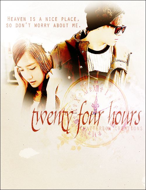
First Impressions: [6/10]
at first glance what i thought (sometimes unedited thoughts
and how my mind works when i first look)
looks alright. the images are over processed to me.
over sharpened and over colored. all the details on the guy's face is gone. not many shadows.
the rest is pretty good. its not jaw dropping amazing for me but it looks appealing.
Technique: [18/20]
how masterful are you at blending/cutting
the blending is pretty good. there could be some improvements.
where the girls hand and the guys jacket meet it needs a smoother transition.
blurring the jacket might help. also i feel the girl is erased too much.
Resources: [17/20]
does your images/stocks/brushes/textures enhance the poster
the images are ok. they work. i think the quality of them were good.
i cant really tell though since they were oversharpened and it lowers the quality of the whole poster.
i like the clock stock. it matches the title and its a nice touch.
i would have liked to see more stocks used to elaborate on the mood and story.
for instance i dont really see the touch of sadness or angst
when i look at this poster.
maybe adding raindrops, or old photographs, or whatever
makes sense for this story would help.
the poster looks nice and simple.
the background looks almost like a solid color.
it kind of works for this poster but maybe try to add some textures next time.
maybe subtle things like paper textures or maybe some soft colors to change to mood.
examples::
Composition: [17/20]
Please Subscribe to read the full chapter

Comments