keep-the-faith
Graphic Review Archive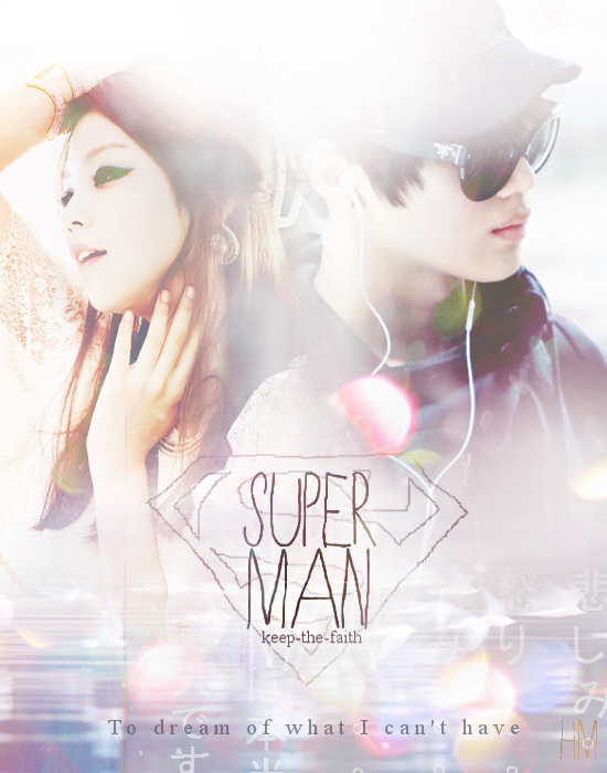
First Impressions: [10/10]
at first glance what i thought (sometimes unedited thoughts
and how my mind works when i first look)
i liked it. i had a positive first impression of it.
the colors are light and they look airy.
its pleasant to look at.
Technique: [19/20]
how masterful are you at blending/cutting
i think the blending is very good here. i think you chose the images well for it.
light color image backgrounds on a light canvas.
there are some minor points that could be improved.
see where the girl and the guy meet his hoodie and her hair.
and also her shoulders and the bokeh.
Resources: [18/20]
does your images/stocks/brushes/textures enhance the poster
the images are pretty good in terms of quality and size.
the girls image is pretty well chosen. her position is strange but not bad.
the guy's picture is kind of boring though and doesn't help with the theme or story.
I like the direction he's looking but otherwise it doesn't enhance the poster.
the colors / textures on the image are nice simple and work.
im a bit confused about the bottom part though.
do i see birds and water? it feels random and im not sure if it has relevance to the story.
the super man sign is uber cute.
i would have liked to see some more stock usages that relate to the story,
Composition: [20/20]
did you create an eye catching and balanced piece
how well does your piece "flow"
the composition is good. it works and its easy to look at.
i like the placement of the characters an

Comments