INFINITEaddict193
Graphic Review Archive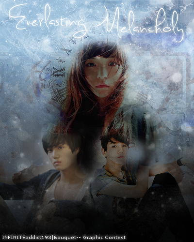
First Impressions: [6/10]
at first glance what i thought (sometimes unedited thoughts
and how my mind works when i first look)
hmm..... it seems sort of like things were done backwards to me?
well there is no "right" way to make posters, but the easiest way for me,
is to blend images first, then to add background/effects.
this poster looks like the background was on first and the images "forced" into them.
was this a tennis battle/challenge? where you had to use something premade?
because to the left of the girl i see some lingering text.
it looks pretty messy as is right now.
Technique: [10/20]
how masterful are you at blending/cutting
the blending could use some work.
ive seen the image of the girl before, and although it is pretty, it is super hard to use.
i think you should have skipped it and switched the photo.
i remember there was a lot of cut off on her picture and her hair was everywhere.
the darkness of the photo probably made life difficult and thats why it was hard to blend.
light backgrounds go on light posters more easily.
dark backgrounds on dark posters.
the two guys on the bottom are not bad, but aroudn their heads it doesnt looks so smoothly transitioned.
also theres a "hole" near the head of the guy on the right
i suggest taking a look at this tutorial:
http://fliyng-high.co.nr/tutorial01.php
this method of blending is my favorite but there are also other tips that can help if you dont like this method.
Resources: [10/20]
does your images/stocks/brushes/textures enhance the poster
the images are all different in terms of their quality, sharpness, and skintones.
to make it a more cohesive piece, it would be nice to see all these things match.
the girl is very dark / yellow and pretty sharp and contrasting.
the left guy is blurry, and needs some contrast. the right guy is sharp.
i would play with settings like: curves, levels, brightness/contrast
also because her face is so yellow, i feel like the blue background is bit not matching.
it looks and feels "snowy" and "cold" to me.
i would choose some different textures. to bring the piece together.
when i talked earlier about the order of the poster, after i blend images together.
i usually take a subtle texture and multipy it just so the background isnt stark white.
or you can take a brush and put a soft gray over it on a new layer.
then i usually use some some colorful textures and play around to see what looks nice.
i then edit the textures like erasing/blurring where the faces are covered so it doesnt beceome distracting.
i suggest taking a look at these textures: http://artificial.kloud-nine.com/textures.php
as they are pretty versatile and can be used in multiple situations.
i like the clock looking thing in the background, but if it were to made more obvious i woul

Comments