cinnamon's spice

Graphic Review Archive
Please Subscribe to read the full chapter


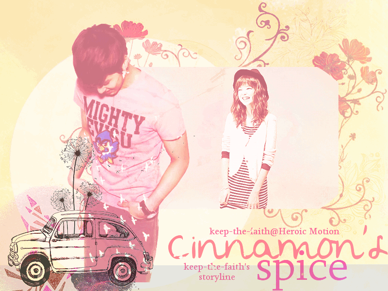
First Impressions: [6/10]
at first glance what i thought (sometimes unedited thoughts
and how my mind works when i first look and access)
"oh. it moves. [stretch of time passes] why? is it necessary?
it does not seem like it adds/enhances the poster. to me it hurts it.
so what is she doing. she's walking. towards his back while laughing like
she's going to sneak up on him and yell boo! looking at
the rest of the poster: it does not have a WOW factor
to me but its appealing"


Technique: [12/20]

how masterful are you at blending/cutting
There is nothing that screams bad blending here. some spots are too "jagged"
that could have been smoothed out while cutting or less sharpened or blurred the edges.
some of these spots are circled. see the dude's hair lines.
also the guy's legs have been chopped off. i would suggest either smudging
his legs and extending it to the bottom, moving him lower, or
changing the size of the canvas. additionally, the spots are circled on the
character's faces, the brushes/stocks overlap them and
i think it would have been better to erase them out,
it may be subtle in this poster, but with other textures/brushes
it could be distracting. i just thought it was worth mentioning.
this now is only the super observant may notice:
what happened to the rounded edges on the girl's picture?
i'm not sure if it wasn't made properly or got processed and changed but
just in case. in photoshop: use rectangular marquee tool to box image,
go to the bar on top, select > modify > smooth
lastly, the arrow on the bottom points to the difference in color
i feel like this was unintentional/overlooked.


Resources: [12/20]
does your images/stocks/brushes/textures enhance the poster
first i'll talk about the image of yunho. that's a hard image to work with
i would not have used that image of him unless it was more zoomed in.
or i would only use it to take advantage of the angle
he makes with his neck and the space there. 
the girl's image, shes ok. theres

Please Subscribe to read the full chapter
Like this story? Give it an Upvote!
Thank you!
vanessax17
sorry ive sort of neglected this ahaha but it takes me at least a solid hour to do one! and i dont like starting and stopping so i need to find some down time

Comments

You must be logged in to comment
BunniesOnTheMoon
#1
Chapter 50: Sorry for the late comment bb! Thank you for the review! I wasn't too sure on this one, and I started doubting myself after I sent it in, but I guess I should be more confident because you thought it was interesting ^^
I do admit I oversharpenined this a bit more than I should XD The pictures used were fuzzy after I resized and I overcompensated by sharpening too much OTL
<3
SapphireQueen #2
Chapter 41: oh no :c
you are my favorite reviewer <3
well, always supporting :D
Stargawn #3
Chapter 41: Nooooo!! :"( that makes me really sad. I really liked the way you reviewed. I think you're the best reviewer I know here and you're one of my favorite designers too ^_^
Oh well...it's understandable. I wish you good luck with your other things=]
ChibiMusicStar
#4
Chapter 41: awww too bad >.<
Your reviews are awesome and you are one of my fav designer + reviewer. Good luck in your studies and graphic skills :D
vanivici #5
Chapter 41: Awww too bad!
I really like your way reviewing a poster. C:
Andd you're one of my fav designer , and i think you are the best reviewer out there! XDD hahaha
Goodluck for your another things then! <3
teaquiIa #6
would you like to be an affies? c:
a graphic review shop, `( gleaming sunset; www.asianfanfics.com/story/view/243077
CoolerThanYou #7
Poster Link : http://i4.minus.com/ixFyisXJUkTnT.jpg
theme/mood : angst, mistery
story link : http://www.asianfanfics.com/story/view/406486/his-dark-side-originalcharacter-exo-kai
any difficulties : I have problems on choosing fonts. I hope you can help me on that :D
Program used : photoshop cs5
Any other comment : Thank you :D
ChibiMusicStar
#8
poster link:http://i.imgur.com/gvvu9cX.png
theme/mood of story:romcance and sad
story link: n/a
what you hoped to achieve / any difficulties:
Hmm i overuse blending at Jessica and the stock was kinda blurred right? So basically i want to try something new and fresh. Ohh i have problem with the placement of stocks and fonts :D
program used: Gimp :D
any other comments: Vanessa is the coolest XD
Soshiss
#9
poster link:
theme/mood of story:
story link: http://www.asianfanfics.com/story/view/387184/loveplayer-you-exo-exom-luhan
what you hoped to achieve / any difficulties: i hope to archieve is to blend some colors together with the used of textures (: Diffulties? Hard to find a suitable texture.
program used: Gimp...
any other comments: nope