+ g-nshx
` m a g n o l i a — a graphic review shop :: 「 REOPENED AFTER YEARS! 」
magnolia
g-nshx
Review
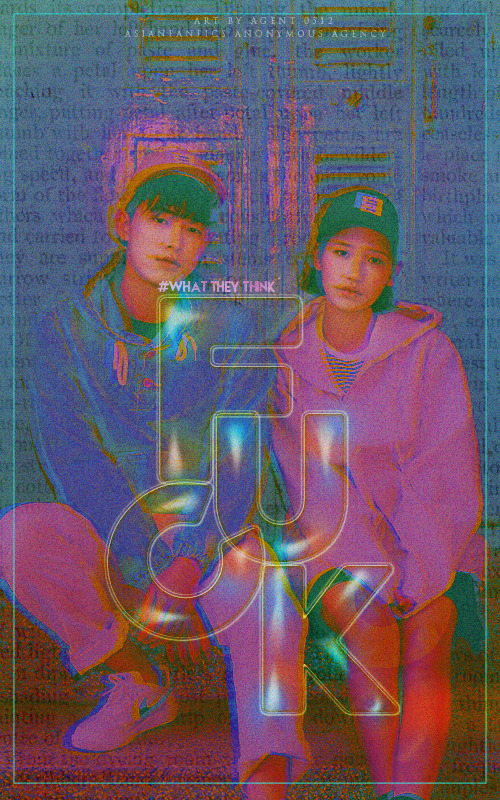
First impression [2/5] : For some reasons that I will make clear in the rubrics below, my first impression to this graphic isn't really good.
Font [7/10] : The typography is cute and fun, to be honest. And the '' one, I like it since it looks very teenager-ish and fun. You may want to make some things clearer, though.
Mood [10/15] : No genre explained, there is nothing to say. It does look like a 'rebellious' genre... right?
Coloring [2.5/10] : I am sorry, but I feel like the coloring is the biggest turnoff to me. 'Heavy coloring' does not necessary mean doing the poster with glitching color, and it's not pleasing to the eye at all since it hurts my eyes, that my first impression got so low. It makes the poster look less HD and made unprofessionally.
Placement [8/10] : Placement is pretty fine, not gonna say a lot.
Blending [10/15] : Is there a newspaper texture behind...? And what are the boxes(?) on top of the people? I don't feel like it's really blended in, and there is not so much blending in the graphic.
Resources [12/20] : Picture choice fits the genre, however, not many resources are used here. PSD coloring or any coloring you are using (and even if you don't use any colorings) are not the best choice and can totally be improved.
Overall look [5/15]
Total score: 2+7+10+2.5+8+10+12+5 = 56.5/100
Personal comment: First of all, I am sorry if it is too harsh or it's an inaccurate review o/ This is my personal opinion and people's opinion can vary! I stalked your tumblr and honestly there are several graphics that are a lot better than this one, so I assume that this one just doesn't fit my style at all. There are still a lot room and chance for improvement! -asdfghjm15

Comments