+ sognatore-xo

` m a g n o l i a — a graphic review shop :: 「 REOPENED AFTER YEARS! 」
MAIN HEADER

magnolia

sognatore-xo


Review

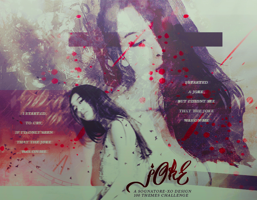
First impression [3.5/5] : Hmmmm, my first impression is pretty usual.

Font [8/10] : I think I like the title font since it looks so fancy. But I think I don't really like the quote font, since the line spacing is a tad bit too large? But the title font is so cool!

Mood [11/15] : Never heard of a genre named insanity...? Maybe if it's 'insanity', isn't it more into something like 'psychology'? When I hear the word insanity, the images that pop out are the ones like Joker, or the figures of people who are in an asylum, honestly.

Coloring [5.5/10] : Thick af, isn't it? It reminds me of the time back then where I was so newly exposed to colorings and I applied like 5-6 to an image and then my friends will always scold me for that HAHAH. but really, it does look really thick that it feels like above all layers there is one color layer and you just reduce the opacity?? A thick coloring is okay, but I suggest not to actually make the characters' skin color turn 1000% away from their original color, unless you are planning some manips like Avatar...

Placement [8.5/10] : The placement is pretty cool!

Blending+technique [15.5/20] : The texture blending and all are fine. I just have a slight issue with the box that covers the person's face, but also not covering it at the same time? It looks pretty annoying and I don't really think it really fits. If you want to cover the girl's eyes, maybe you can use a brush. 

Resources [4/5] : Pretty fine!

Originality [8/10] : I think it is pretty original?

Overall look [11/15]


Total score: 3.5+8+11+5.5+8.5+15.5+4+8+11= 75/100


Personal comment: First of all, I am sorry if it is too harsh or it's an inaccurate review o/ You are already good, but always remember that there is a lot room for improvement, okay! Please leave a comment after you read this just to let me know, and if you feel like the review helps you to improve, upvotes are appreciated. Thanks for requesting here! -asdfghjm15

Like this story? Give it an Upvote!
Thank you!
sandeoki
luvkookietae and mary517 are up! { magnolia }

Comments

You must be logged in to comment
aneyeos
#1
still open?
LocaLina
#2
Chapter 35: Chapter 32: username: LocaLina
blog post link: https://www.asianfanfics.com/blog/view/1263007
experience, e.g. 3 months: 5-ish years creating graphics, only 1 year seriously
editing program used: Affinity photo on an iPad Pro
graphic link: https://i.imgur.com/HuzrwOc.png
graphic title: Inhuman
genre: scifi, artificial intelligence
things you'd like to be emphasized in the review, e.g. typography: overall
the story the graphic tells: A story about a girl who ends up befriending her father's top secret experiment which is an AI that is scarily human compared to the others. Once she finds out her father's true purpose for the AI she helps the AI break out of the laboratory and they go on the run (I can't tell more without spoiling it to no end to my readers).
Kuroko_Baseku
#3
fefedove
#4
Hi∼ your reviews are so nice but can I see some of your works or portfolio? I want to learn haha
Iamdead
#5
Chapter 32: Chapter 29: Chapter 29: Chapter 29: Yah!! Thank you so much for putting the time and effort into reviewing my poster, I really appreciate it!
Im glad you remember me, hopefully i have improved since then XD
my typography has always been lacklustre ;-; tech me ples
and i have no idea how to do long titles XD
The ghosts are telling the children to come play with them, and when they do, they become faceless ooooooooh
for the blending yes youre right, that is exactly what I did huhuhu
/ashamed T^T
It looks pretty normal on my phone, what do you see?
yeh i need sum more kool resources, this was made in the earlier days of my designing so i just threw stuff together and hoped it looked good huhu ;-;
i dont really do that more, like i dont really throw tons of textures on a poster instead going for something a bit more simplistic i think
I really like manip these days, isso kool!!
Glad you're back and TECH ME SENPAI <3333
Xophias
#6
Chapter 35: First time I came across a graphic review, quite refreshening! :D Love how you chose your criterias :)
Mary517 #7
Chapter 34: I'm actually surprised this is the reviews cuz this is still one of my fave piece pre 2013.... i think the specific date was actually the summer of 2008/9 cuz i remember i was taking requests for stories while doing a summer session at university ^^

But its unfortunate that you think its plain... this isn't a "BLEND" .... this was skewing away from blend and playing with "new" styles. Its one of my variations I call "stock and block" .... i made that up way back when.
I'm not sure i understand your "placement" comment... if you look at the posters... the boys are sized the same and evenly placed around iu.... and i'm not sure i know where else to place the title.... lower? please elaborate ^^
the images of the characters weren't meant to be "blended" Its TONS of layering. and duplicating image. But yes... as for resources... only one stock was used.

(i didn't know you were critique-ing "blends".... i thought you were experienced in graphics and would be critique-ing design) xD

but it was refreshing hearing your thoughts. I'll be sure to come back and request a review with something new
THANKS FOR THE REVIEW ^^
stonee
#8
username: stonee
blog post link: https://www.asianfanfics.com/blog/view/1261506
experience, e.g. 3 months: 3 years
editing program used: photoshop cs6
graphic link: https://i.imgur.com/VU5EWbr.png
graphic title: Blood Thirst
genre: mystery, supernatural
things you'd like to be emphasized in the review, e.g. typography: typography, color used and the overall atmosphere/feel/vibe that the design gave since there's no character face to show the emotions
the story the graphic tells: it don't have story but the design was to emphasized about vampire. Honestly, it was design out of fun with not background story for it ^^;;
anything you'd like to say: not related to the graphic but i'm glad to see a graphic review shop that still open and alive since most already abandoned or closed xD
Overdose_Kpopers
#9
Username: Overdose_Kpopers
Blogpost Link: https://www.asianfanfics.com/blog/view/1261498
Experience: i think 6 years and half
Program: photoshop cs 6
Graphic Link: https://78.media.tumblr.com/e221b210f86766dcafe78e4cc2ce17d6/tumblr_pb614oGHpg1u3ivp3o1_1280.jpg
Title: A little love wont hurt right?
Genre: Dark, angst, mafia
Emphasis: Nothing in particular ~
Story: It's about three friends on a mafia world, how did they got there? not sure
Anything else: noppie
jaxial
#10
Chapter 33: Thank you for the review! I know he’s super grainy but my school lab has photoshop installed but it doesn’t allow plug ins nor other downloads so I made this with what limited resources I had at the time and that’s very less XD
The torn paper was just because I wanted it to look like someone ripped out a line to reveal the poster beneath lol

This is literally the best font I have cuz ugh school again it doesn’t have any nice fonts at all I mean like dude who uses Trajan pro for angst posters?
Thanks again! This was really helpful^^