+ fanfanzela99
` m a g n o l i a — a graphic review shop :: 「 REOPENED AFTER YEARS! 」
magnolia
fanfanzela99
Review
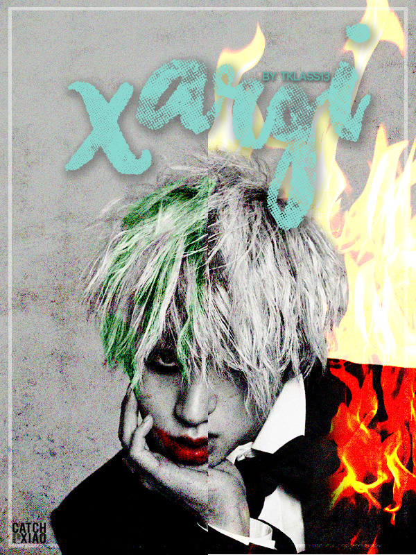
First impression [4/5] : My first impression was "is that zico" HAHHAHA it's nice!!
Font [7/10] : My only issue is... why light blue, when the genre is mafia? When I read mafia, I was thinking of an extremely red x black text or something hardcore that isn't a calligraphy font. (ps the credit is so cute)
Mood [10/15] : I am sorry, but for me, other than the picture choice, the rest doesn't explain the genre really well. It feels more like a profile graphic and the fire isn't really helping...?
Coloring [8.5/10] : Coloring is pretty gorgeous and pleasing to see, although the blue text is a little bit off.
Placement [8/.510] : Also, the placement seems to be pretty okay? No big issues here.
Blending+technique [15/20] : My biggest issue is just the fire, actually. The fire isn't really nicely blended to his body, the layer mode isn't very pleasing too. And the part of the fire that touches his hair is just... really off, I don't know? Maybe using a fire brush or a smoke brush can fit better other than using a stock.
Resources [3/5] : The choices are OK.
Originality [8.5/10] : I feel that it's pretty original.
Overall look [11/15]
Total score: 4+7+10+8.5+8+3+8.5+11 = 75/100
Personal comment: First of all, I am sorry if it is too harsh or it's an inaccurate review o/ There is so many room of improvement and you can experiment in many things! Thank you for requesting here, please leave a comment once you've read this to let me know, and if you find this helpful, we appreciate upvotes! -asdfghjm15

Comments