+ spark931

` m a g n o l i a — a graphic review shop :: 「 REOPENED AFTER YEARS! 」
MAIN HEADER

magnolia

spark931


Review

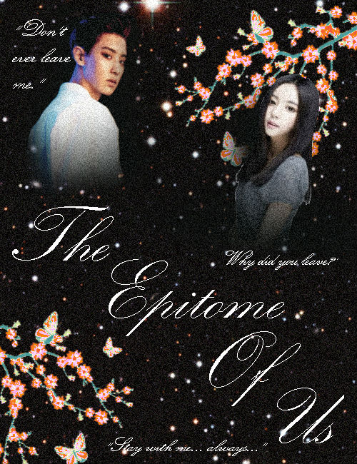
First impression [0/5] : My first impression is already not good ever since I saw your 'anything you'd like to say' column, that I really can't wait to write your review only to point these things out. You know that you have been doing the things that might not make your graphic as good as possible, so, in all honesty, my review might not be so important. Excuse me, why the heck are you 'too lazy'? 'Lazy' is no longer an acceptable reason, and no good improvement goals can be reached when you are lazy. Also, pixlr is a phone app, right? It might be hard to do a lot of edits on phone, so I truly suggest you to use laptop apps, be it online or not. The good designers weren't proficient as well.

Font [5/10] : The quote is not readable and the font is just the same with the title, which looks somehow boring. Nothing is barely done at the typography, so I can't really say anything. (you realize it by yourself though, you mentioned 'in case if it's hard to read' in your aff page, so don't you know that it's hard to read and not pleasing?)

Mood [12/15] : Black background gives the vibe of angst, but you definitely can do better. The girl is smiling, tho?

Coloring [5.5/10] : Matching the color schemes of the characters in a poster is a must. The girl's skintone and Chanyeol's are way too different, that they still feel like they come from totally separated picture and it doesn't form one graphic, you get what I mean? (you mentioned this in your aff post, means you realize this, please do things that can fix the mistakes yourself even realize). The flowers are cute, though.

Placement [5/10] : The girl and boy are just placed awkwardly that the poster doesn't seem to tell a story. The text is placed way too dominating.

Blending [5/15] : Blending doesn't just mean 'deleting the bottom part of a png' and you get it. Just deleting their bottom parts are weird, and it doesn't blend with the background. Adding more pictures can work for this. All the pictures still look 'off. Also, please do not be lazy to fix the fix-able imperfection, esp. the girl.

Resources [10/20] : You did try some things like adding the stars behind, however, it still doesn't look nice and still off. Maybe you can try putting another texture on top of everything, or a coloring (but pixlr barely has any graphic-worthy coloring packs, right)

Overall look [6/15]


Total score: 0+5+12+5.5+5+5+10+6 = 48.5/100


Personal comment: First of all, I am sorry if it is too harsh or it's an inaccurate review o/ There is still a lot room of improvement, okay? Although I know that it's inconvenience to be detail and diligent in phone edit apps, please do try to fix the things as hard as possible! Do well! ^^ -asdfghjm15

Like this story? Give it an Upvote!
Thank you!
sandeoki
luvkookietae and mary517 are up! { magnolia }

Comments

You must be logged in to comment
aneyeos
#1
still open?
LocaLina
#2
Chapter 35: Chapter 32: username: LocaLina
blog post link: https://www.asianfanfics.com/blog/view/1263007
experience, e.g. 3 months: 5-ish years creating graphics, only 1 year seriously
editing program used: Affinity photo on an iPad Pro
graphic link: https://i.imgur.com/HuzrwOc.png
graphic title: Inhuman
genre: scifi, artificial intelligence
things you'd like to be emphasized in the review, e.g. typography: overall
the story the graphic tells: A story about a girl who ends up befriending her father's top secret experiment which is an AI that is scarily human compared to the others. Once she finds out her father's true purpose for the AI she helps the AI break out of the laboratory and they go on the run (I can't tell more without spoiling it to no end to my readers).
Kuroko_Baseku
#3
fefedove
#4
Hi∼ your reviews are so nice but can I see some of your works or portfolio? I want to learn haha
Iamdead
#5
Chapter 32: Chapter 29: Chapter 29: Chapter 29: Yah!! Thank you so much for putting the time and effort into reviewing my poster, I really appreciate it!
Im glad you remember me, hopefully i have improved since then XD
my typography has always been lacklustre ;-; tech me ples
and i have no idea how to do long titles XD
The ghosts are telling the children to come play with them, and when they do, they become faceless ooooooooh
for the blending yes youre right, that is exactly what I did huhuhu
/ashamed T^T
It looks pretty normal on my phone, what do you see?
yeh i need sum more kool resources, this was made in the earlier days of my designing so i just threw stuff together and hoped it looked good huhu ;-;
i dont really do that more, like i dont really throw tons of textures on a poster instead going for something a bit more simplistic i think
I really like manip these days, isso kool!!
Glad you're back and TECH ME SENPAI <3333
Xophias
#6
Chapter 35: First time I came across a graphic review, quite refreshening! :D Love how you chose your criterias :)
Mary517 #7
Chapter 34: I'm actually surprised this is the reviews cuz this is still one of my fave piece pre 2013.... i think the specific date was actually the summer of 2008/9 cuz i remember i was taking requests for stories while doing a summer session at university ^^

But its unfortunate that you think its plain... this isn't a "BLEND" .... this was skewing away from blend and playing with "new" styles. Its one of my variations I call "stock and block" .... i made that up way back when.
I'm not sure i understand your "placement" comment... if you look at the posters... the boys are sized the same and evenly placed around iu.... and i'm not sure i know where else to place the title.... lower? please elaborate ^^
the images of the characters weren't meant to be "blended" Its TONS of layering. and duplicating image. But yes... as for resources... only one stock was used.

(i didn't know you were critique-ing "blends".... i thought you were experienced in graphics and would be critique-ing design) xD

but it was refreshing hearing your thoughts. I'll be sure to come back and request a review with something new
THANKS FOR THE REVIEW ^^
stonee
#8
username: stonee
blog post link: https://www.asianfanfics.com/blog/view/1261506
experience, e.g. 3 months: 3 years
editing program used: photoshop cs6
graphic link: https://i.imgur.com/VU5EWbr.png
graphic title: Blood Thirst
genre: mystery, supernatural
things you'd like to be emphasized in the review, e.g. typography: typography, color used and the overall atmosphere/feel/vibe that the design gave since there's no character face to show the emotions
the story the graphic tells: it don't have story but the design was to emphasized about vampire. Honestly, it was design out of fun with not background story for it ^^;;
anything you'd like to say: not related to the graphic but i'm glad to see a graphic review shop that still open and alive since most already abandoned or closed xD
Overdose_Kpopers
#9
Username: Overdose_Kpopers
Blogpost Link: https://www.asianfanfics.com/blog/view/1261498
Experience: i think 6 years and half
Program: photoshop cs 6
Graphic Link: https://78.media.tumblr.com/e221b210f86766dcafe78e4cc2ce17d6/tumblr_pb614oGHpg1u3ivp3o1_1280.jpg
Title: A little love wont hurt right?
Genre: Dark, angst, mafia
Emphasis: Nothing in particular ~
Story: It's about three friends on a mafia world, how did they got there? not sure
Anything else: noppie
jaxial
#10
Chapter 33: Thank you for the review! I know he’s super grainy but my school lab has photoshop installed but it doesn’t allow plug ins nor other downloads so I made this with what limited resources I had at the time and that’s very less XD
The torn paper was just because I wanted it to look like someone ripped out a line to reveal the poster beneath lol

This is literally the best font I have cuz ugh school again it doesn’t have any nice fonts at all I mean like dude who uses Trajan pro for angst posters?
Thanks again! This was really helpful^^