+ doshinsae
` m a g n o l i a — a graphic review shop :: 「 REOPENED AFTER YEARS! 」
magnolia
doshinsae

Review
First impression [1/5] : Apologize for it, but I'll explain it in the rubrics.
Font [4.5/10] : I... I don't know. I never think Comic Sans just works for a nice graphic. The text box is annoying. The title on top of the graphic is ways toooooooo gapped and it feels very empty too. The font choice isn't creative, too. I suggest you to download fonts from dafont.com. Also, isn't the 'i' in 'is' supposed to be small? Let's move to the bottom font part. If you are planning to make it shape like the triangle, the tilting isn't even symmetrical to the triangle shape, it's several degrees off, right? It's a pet peeve for me, since it's not pleasing for the eyes. Also, I didn't come here for a head exercise where I had to turn my head whenever I want to read a part of the title and the quotes.
I tried reenacting(?) the title and quotes, and I got this: (apologize I am in my brother's laptop and the lack of resources is real) Fonts used: Bromello (main), Burst My Bubble (speech bubbles)

Mood [11/15] : I feel the mood, but only because of the title name and the color.
Coloring [4.5/10] : No coloring changes are done here and it's just merely adding the background and pictures and texts, and I still think that the pictures doesn't fit the damn blue background. Like they are still in a separated color scheme, for me. They don't look like they belong in one graphic. Here is my opinion about the blue background. The blue and the white still feels 'separated', and even though light blue is my favorite color, I can say that I don't like it on the poster. You can't just change a background and voila, you get a new genre? There are more things to be done other than just that. You can google 'gimp colorings' for resources, I guess.
I'm not sure how to explain this, so let's go with a picture.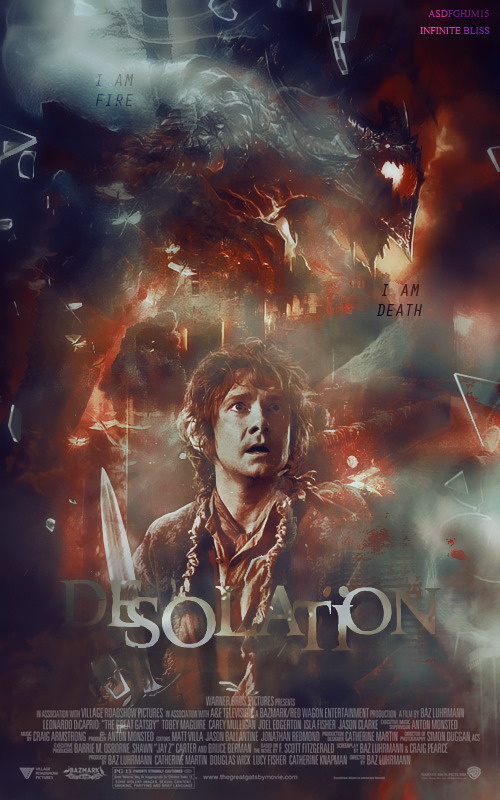
I have a dark red, black-ish background. It means, the character's face needs to blend in the background and the color fits in (but it doesn't necessarily mean making the face literally all red and black). Just the same color scheme between the background and the face is perfectly fine. I hope you understand this...
Placement [6.5/10] : Poor placement for the text on the very bottom corner.
Blending+technique [10/20] : Everything is barely blended and it looks just like putting anything you have into one frame without any further things done. Baekhyun's cheeks are rendered very messily, that he lost his cheeks?? Tao's hair, too. There are absolutely no textures or other stocks/pictures to be blended, I really suggest you to start saving some.
Resources [2/5] : Pretty okay picture choices, but lack of resources gives it a - point.
Originality [7/10] : I sorta feel that it's pretty cliche already.
Overall look [6.5/15]
Total score: 1+4.5+11+4.5+6.5+10+2+7+6.5 = 53/100
Personal comment: First of all, I am sorry if it is too harsh or it's an inaccurate review o/ Phew, this might be my longest review. A thing I'd like to say is it's okay to experiment with so many new things and tools! Also, the room for improvement is still really big. Thank you for requesting here, please leave a comment after you saw this to let me know, and if you feel that this really helps you, upvotes are appreciated! Thanks! -asdfghjm15

Comments