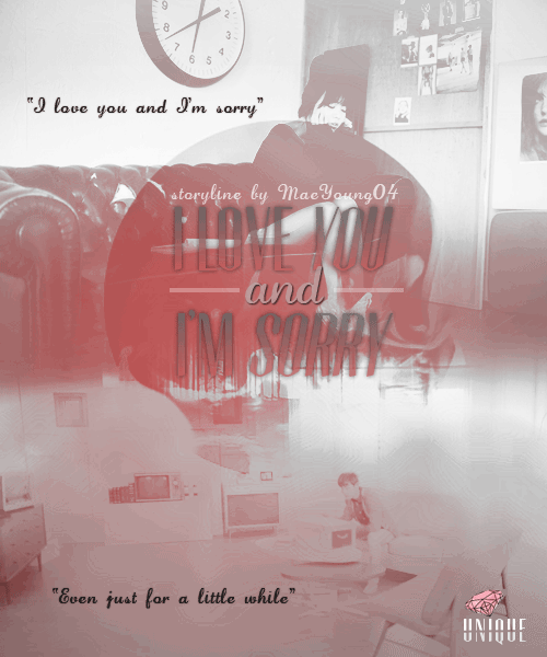
I was impressed at how you placed the words. However, that black gradient made it look a bit, I don't know, out of place? A lighter colour would be better.
And as for the quotes, black is too dark. It's fine but if I may suggest, a grayish shade of red would suit the best. Colors [13/15]
The colouring is good. But the gif was darker than the image above. Maybe, try adjusting the brightness or contrast more. Pictures [13/15]
You did a good job at arranging the images. But the blending didn't really caught my eye. You just basically erased the bottom of the top image and also the top of the gif. Overall making [36/40]
The title was placed too high that the face of the girl is almost covered. Lowering it a bit wouldn't hurt though, since the top of the gif is quite empty. What I mean is, the guy's face or any other important details of the gif wouldn't be affected. Bonus [10/10]
Perfect bonus for the title technique and its placement. :D
Comments