INFINITEaddict193
Graphic Review Archive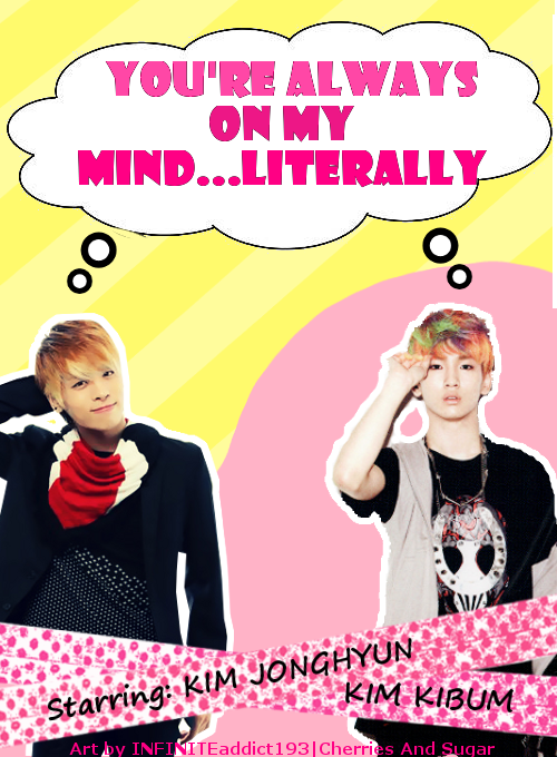
First Impressions: [5/10]
at first glance what i thought (sometimes unedited thoughts
and how my mind works when i first look)
"it didn't really leave me with a positive impression, when i first saw it.
its not bad, its's just not amazing. there was nothing jaw dropping."
Technique: [14/20]
how masterful are you at blending/cutting
The image on the left is cut well and the outline is nice and smooth.
The image on the right however has multiple issues. The cut is not smooth,
and then surrounding it, the outline seems to be a of the image,
which reflects the jagged edges. It seems like it was cut in paint
with the box eraser. To fix this, i would conside smudging the edges
out after cutting. Or cut with a different tool like the pen tool or path tool for gimp.
Resources: [7/20]
does your images/stocks/brushes/textures enhance the poster
the images used are ok. i think they were chosen to match the
"thinking of you in my mind, so i point to my head" theme.
The quality of the photos are fine, I would have editted them both to match
skintones using the curves function.
The speech bubble could have been done better.
Just doing a google image search for "speech bubble" brings a few
results that could have been used. It bothers me how the circles towards their heads
are /outlined much more thicker than the bubble.
It doesn't match well. I also don't like that floral pattern strip.
The background is quite random to me, espcially the pink blob behind
the character on the right.
I'd look into getting more textures and resources. They could have added a lot.
Look for some basics like: paper textures.
Composition: [15/20]
did you create an eye catching and balanced piece
how well does your

Comments