meowpikarawr
Graphic Review Archive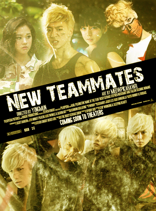
First Impressions: [5/10]
at first glance what i thought (sometimes unedited thoughts
and how my mind works when i first look)
woah thats a lot of people. i applaud you for trying. its not easy to put in that many.
the composition (people placement / text placement) is pretty orderly and neat,
the effects however are very messy and kind of random.
to me it seems like "oh theres some blank space let me cover it up with the first thing i grab"
theres a mix of grunge textures, bokeh textures, and this sort of halftone/scanline -ish patterns.
the poster is ok. it doesnt repel me, but it also doesnt wow me.
Technique: [12/20]
how masterful are you at blending/cutting
with so many people and so many images, its bound to be a pain
to put it all together.some parts are not bad like
the guy in the scary mask is blended pretty well, and the guy below him also.
otherwise, there are some parts that stick out too much for me.
the cutting on the girl next to the scary mask dude is really apparent and looks weird.
she sort of seems...flat...like a paper cut out, cause the background is darker,
it seems like theres a drop shadow behind her.
there are some other random bits that could be blended better.
i can see the color differences between the image and the background.
choosing the right images would help.
images with light backgrounds blend easier into light backgrounds.
images with dark backgrounds blend easier into dark backgrounds.
mixing them is hard to do and they stick out too much.
here's a tutorial about one way to blend. theres some random tips in there as well
that might be handy even if you dont like using the method below.
http://flying-high.co.nr/tutorial01.php
Resources: [10/20]
does your images/stocks/brushes/textures enhance the poster
the images themselves are good and suitable.
quality is good. i know its a pain to find good images.
the textures though are overboard and distracting like i mentioned above.
theres too many elements going on, and each element does something different.
for instance bokeh (the circle light dots) are better for dreamy romantic poster.
and that doesn't really match to me in an action poster.
the dirty bits of the grudge textures are fitting to the mood but they are really sticking out and in your face.
some parts are too distracting and take the focus away from your characters.
another big no no for me is textures on top of character's faces. its way too distracting
and sometimes pretty awkward. makes me wonder if their face is dirty.
try to blur out that part of the texture or erase it when its on top of the faces.
another thing that i would have liked to see were stock usages to enhance the meaning of the poster.
using some images of items that have significance to the story.
viewers should have a sense about what the story is when looking at it.
is it about... racing? or guns? or spies? or gangs? or money? or city life? or sports? or ionoo.
using some stocks can help show what it will be about.
the colors are ok. they dont scream action to me.
yellow = energy? pikachu? cowardness? dont know but it d

Comments