topsecret99
Graphic Review Archive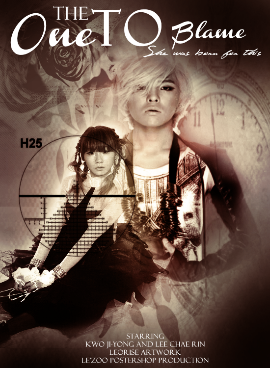
First Impressions: [6/10]
at first glance what i thought (sometimes unedited thoughts
and how my mind works when i first look)
this poster made me feel really uneasy when i first looked at it.
not beause of anything related to skills but beacause of her face LOL.
i dont know. her expression scares me.
ok anyway. the second thing i noticed was the distorted images.
(the clock and the guy) they seems stretched.
when you resize images please please please keep the proportions the same.
http://docs.gimp.org/en/gimp-tool-scale.html
Im not familiar with gimp but this link tells you how to keep the aspect ratios the same
by holding down the CTRL button when grabbing a corner.
ok ill continue on now:
Technique: [12/20]
how masterful are you at blending/cutting
the blending with the backgrounds is better this time
but there is still areas that could be improved.
the space between the two characters is sort of messy.
his necklace (?), the apple, her skirt its all quite confusing.
when blending try to make each element clearly seen.
dont make the viewer go "is that an arm?" or something similar.
not sure if youve checked this out, but this may be useful.
http://flying-high.co.nr/tutorial01.php
even if you dont blend using this method, there are some other tips in there that can help.
Resources: [13/20]
does your images/stocks/brushes/textures enhance the poster
the images are not bad. the girl scares me but its a good quality image.
GD is distorted so maybe that has something to do with it,
but the quality of his image is lower. same with the clock.
the flower stocks im on the fence about. the leaves are nice but the roses
i cant tell if i like or dislike them.
i like the crosshairs on the girl, since it helps with the action theme
it also makes me feel like shes the target.
i think some textures would be good here to add some color variation.
right now its really monochromatic (essentially only shade of color)
yup im recommending the same link as last time:
http://artificial.kloud-nine.com/textures.php
ill show an example. just a few more textures / color adjustments could have made it really "pop" more
i cropped out the text cause i want to focus only on the texture usage.
Please Subscribe to read the full chapter

Comments