creamysmiles
Graphic Review Archive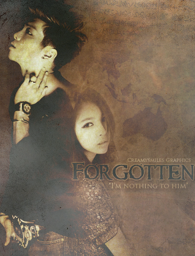
First Impressions: [6.5/10]
at first glance what i thought (sometimes unedited thoughts
and how my mind works when i first look )
"mmmmmm its nice. they look a bit conjoined.
my eyes are screaming for contrast. ill explain
more down in another section. but here is what just
a difference in contrast can do:"
Technique: [10/20]
how masterful are you at blending/cutting
The outside edges of both characters are well incorporated into the piece,
but where they both come together, there are major problems.
I can see a very harsh point at the tip of the girl's head. did you lasso it?
It seems like the guy's dark clothing was dragged out and onto her.
Also the picture placement are good in general areas,
but i'll talk about that more in composition. I would have moved the girl up a bit
because im not sure what happened to the guy's neck but it kind of
follows the same path as her hair line giving the conjoined look.
i would have definitely liked to see her body's border in front of his.
Resources: [12.5/20]
does your images/stocks/brushes/textures enhance the poster
i like the dirty paper texture it works for such a poster.
but make sure to be careful with their faces.
if you look carefully at them, and the guy's is more obvious he looks sorta sick/ill.
scanlines i dont think are necessary. im going to guess
that they were put on top of the final and then the blending mode
was on normal and lower opacity. this contributed to the contrast issue.
it makes your image sort of "fade away"
It's a nice simple piece, and i would have liked to see maybe a stock or two
just to enhance it and give more desc

Comments