NielAhn
Graphic Review Archive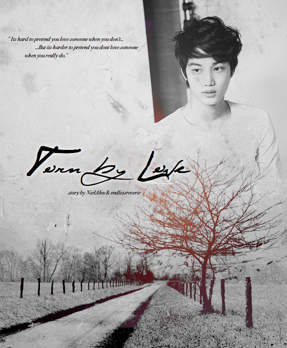
First Impressions: [7/10]
at first glance what i thought (sometimes unedited thoughts
and how my mind works when i first look)
the first thing i noticed when i see this poster, is the speck on his face.
seems like he gots a bruise. anyways, its a nice poster.
it doesnt scream its amazing to me.
the blends seems pretty good.
do i love it? no. do i like it? yeah.
Technique: [18/20]
how masterful are you at blending/cutting
blending is good, but i can't really tell i
f its cause the image was some what "easy" to blend
since the colors were all similar and ithe texture on top hides it.
either way, he is blended into the image quite well.
ithe thing he's leaning on however stands out a lot,
and i would have prefered it if it was blurred out even though i know it could be tricky,
you can try selecting it with the lasso tool and doing a gaussian blur,
or make a new layer and make some spots with a brush tool,
to hide or extend it the dark part.
also the red glow, i can see a solid line where the layer ended.
try to blur or erase harsh edges like that
Resources: [18/20]
does your images/stocks/brushes/textures enhance the poster
images are good. quality is good. texture used is good.
stock is good. not much more i can say about it.
right now the poster seems a bit flat. its nice but i think
its missing that luster. i think another stock might have been good in this situation.
especially since you only have one chracter. there really is only one focal point in this piece.
if you exclude the text, so maybe something simple like a clock?
or experiment with color.
i know the original image was black and white
but you dont have to default to a black and white piece.
you can try to see if something works out.
Composition: [13/20]
did you create an eye catching and balanced piece
how well does your piece "flow"
you mentioned that you dont know what composition is, so ill try to explain it.
(but p.s. i dont thi

Comments