topsecret99
Graphic Review Archive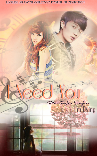
First Impressions: [5/10]
at first glance what i thought (sometimes unedited thoughts
and how my mind works when i first look)
"so this story is about music,"
reads the description.
ohh ok. maybe not. confused.
is it about a little girl looking at trees?
nope. dont think so. very confused.
yup, when i first look at the poster, i dont know what's going on.
not a very positive impression.
ok ignoring that. aesethics. how does it look to me?
its alright. nothing special. doesnt scream amazing.
looks kind of choppy. not very cohesive.
not really like one piece thats all mashed up well together.
ill explain more below.
Technique: [12/20]
how masterful are you at blending/cutting
take a step back first. and look at the poster.
look at the top, its a bright pink / coral.
look at the middle, its pretty white.
look at the bottom, theres these deep red ish parts.
the color changes are very apparent to me,
and it makes the not perfect blending stand out.
the blending is ok, it needs work. let's look at the girls face.
i can see the texture on her. it looks like her face is dirty.
try to blur out the part of the texture where her face is.
lasso, feather and then Gaussian blur it a bit.
it will help the face stay clear.
around the top of her head. look at her backpack now. yeah its disappearing into him,
either show it or don't show. not something in between.
the top of her head is disappearing as well.
there are more problems with the blending like with the guy and the stocks as well.
also. make sure you know where you are placing your images.
the bottom left is should be moved over a bit to the left, there's a 1px gap.
check out this to get more info.
Resources: [12/20]
does your images/stocks/brushes/textures enhance the poster
if you zoom into the girl, there's scanlines around the top of her head.
i dont know where that's from. maybe from the image or texture,
but because its isolated to that one spot, it makes me think you didnt add them intentionally
so i would say pick your resources betters. pick high quality, large images, so details show up better.
do not use photos that are edited. and stay away from cut offs.
EXAMPLES OF BAD PHOTO CHOICES.
luhan cause all these exo request got bad photos.
tiny. unclear face. low hq.
edited. color processed. cut off.
so color processed. i dont even like how it looks right now.
also the tones of

Comments