♡ colatte
silhouette • graphic review & tips {closed}Username: CoLatte
Experience: 2 weeks
Themes: Angst, Horror, Dark

first impression: [ 5 / 10 ] the first thing that catched my eyes are the cracky face of the woman and the red color you used. for me, that cracky face is too eye-catching, too odd. plus the character placement is not really good. the red color you used is good, however the characters' face are covered with this red color. it made the characters picture is not clear. i'll correct some part on your poster. read on.
themes: [ 6 / 15 ] let's start with angst theme. the girl's pic might be good for angst, but the man? i think it's more into themed -bricked- for an angsty poster, you can choose a photo that showing sadness or smile sadly. if you take a look at the man's face, is way too arrogant. next, horror theme. i can't get the horror feels when saw your poster. the 'goosebump' feelings isn't there. the poster is too plain to showing horror feelings. i know you've encouraged to give a horror feelings by adding red color, but it didn't help, sorry to say this TT_TT i think you should change the font into a more horror font and add some horror textures (there are so many on deviantart) and the last, dark theme. this is the only theme that i got the feelings. the texture you used make the poster really got that feelings, goodjob for that! :D but note the things i've mentioned on angst and horror themes.
coloring: [ 14 / 20 ] the black color you used is awesome and matched perfectly with the theme. the problem is on the red color in the middle of the poster. in my eyes, the red color is too strong and too bright. and the red color looked like not blended well with the black color, that makes the red color stand too odd in the middle. in my opinion, it would be better if you use crowded texture than red plain texture like what you've applied on your poster. (will tell you more about texture on resource section) the other thing that i think you should improve is how you apply the color. you can see that the characters' skin are too red. it's okay if you wanted to add some red effect, but i think it's too much red. there is two choices to fix it. first, erase the red texture that passing through the character's face with eraser in opacity 20% and flow 50%. erase patiently until you think the faces not so red anymore. second, you can just make the red texture in lower opacity maybe 40%-55%. hope you got what i meant.
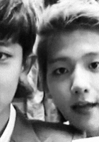
technique: [ 13 / 25 ] for two weeks experience, i think your technique is wonderful. you still have so many times to improve your graphics. here i'll give you a few techniques you should really focus on. first, i wanted to say that your cutting skill is pretty good. you've cut the character's picture so well. about the blending skill, nah. you should really improve this. like i've said before, you haven't blended the colors well. the black and red colors like not united as one. what do you need to do? hm, first, make the red texture brightness more dark. it's too strong. and then, delete a bit the red texture's edge. delete with a lower eraser opacity and flow. still looks not blended well? add psd coloring. you can download and choose many psd coloring at deviantart. my fav is evey-v. just type on the searchbox: psd by evey. and download some psd that you think good for dark angst themed. hope you got what i meant. now, let's see this picture:
 look at the thing i've circled beside the man's pic. the texture you placed there looks too awkward while around the that texture is too plain. you'd better add some more texture. and the smaller circle at the bottom is showing the other awkwardness. all of sudden, a rope showing itself without anything makes it stood. it's too awkward to see that rope there. it would be better if you search a rope that hang on wood or something like that. you should make the rope bit bigger though.
let's move into your character placement. the boy and the girl stands too far between each other. it's why the feelings of the poster is not there. it would be better if you move the boy and the girl's pic more to the middle.
the last but not the least, the house pic you used on the upper side of the poster is too stretched out. what should you do is click ctrl+t on your keyboard. and the selection tool will appear. use the bottom center pointer and stretch it downwards a bit much. it's okay if the house being covered by the character's pic. it will make the poster looks natural instead. hope you got what i was talking about.
resources: [ 4 / 10 ] sorry to say, but the textures you used, i really don't like themT_T first, the red texture, it's too plain. you should use a more crowded texture. for example textures by reecito on deviantart. go ahead and browse her name on searchbox you'll find some dark crowded texture that suits this poster well. the thunder texture that you used is way too awkward and too small to stand there. the color difference, make the thunder texture looks more odd. it will be more awesome if you move the thunder behind the title. i have tips for placing and cutting texture. first, use marquee tool, and then use the elliptical one. second, change the feather into 65 px, then start hope you got what i meant. i hav
typography: [ 8 / 15 ] it's a horror angst and dark themed poster. your title color is matched perfectly. the 'strangers' word placement is good. but 'the' word placement is too far from 'strangers', move it a bit to the right. about the title font choices, your font choices is too monotone and doesn't fit the theme. i recommend you to browse some font on: dafont.com and 1001freefonts.com they have thousands of beautiful fonts you can use. but for dark horror themed i recommend you to use: '28 days later' font. search it on dafont, you'll find it. about the quotes, because you've used red for the title, i advice you to use another color such as white or pale gray for the quotes color so it won't be look so monotone and too full of red. your quotes font is a no no, i'm so sorry to say this. hm, i've made an experiment with the quotes. check it out here: (click). look at the quotes i've made. it looks more dramatic right? i was just simply use courier new and white color. what makes it have a feel? the shadow behind it! how to have those shadow? first, copy the text layer. rasterize the layer and then click filter-> blur-> motion blur. then arrange the distance around 65 pixels. click ok. move the rasterized layer into under the text layer. and tada! you made it. hope you got what i meant.
bonus: [ 4 / 5 ] because it's a goodjob for a 2 weeks experience.
total points: 54 / 100 - under average♡
tips for you: read all things i've said above carefully. and improve your graphic patiently and let the passion grow. you still have so much time to improve. goodluck and hwaiting!XD
-xoxo foxlight-
Comments