♡ wolveswifeu
silhouette • graphic review & tips {closed}Username: wolveswifeu
Experience: 1 year
Themes: Soft-romance
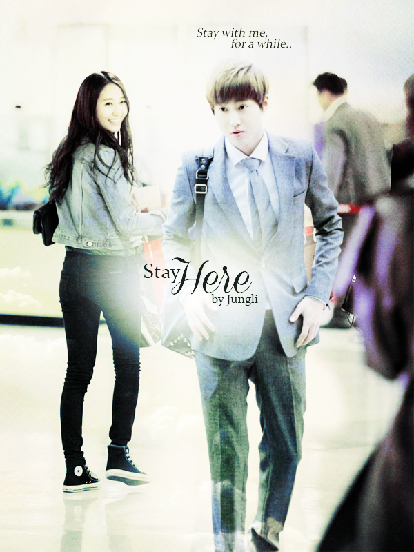
first impression: [ 9 / 10 ] oh my, when the first time i look at your poster, the first thing i got is the feelings. the feelings of this poster is very good. the sweetness and romance are there. kind of melting feelings raising on my heart by only saw the poster. really really really love it! the only thing i don't like a bit is the man's face. because his face is somehow too derp? -bricked- i know it's hard to find the man's picture that suits the poster well, so i could just pass it out from my scoring. still, why not full points? the typography is plain. not too plain, just plain. will tell you about this more in typography section. but, still, this poster is so so so sweet♡
themes: [ 15 / 15 ] perfectly matched with the themes. no flaws. you just set kind of sweet and soft romance there. the color is kinda a little bit too pale, but it's not a big problem. goodjob!♡
coloring: [ 18 / 20 ] the color is okay. i don't think you used any psd? or maybe just a lighting psd? because the poster looks so natural and the lighting is not too bright or too dark. it's balance. and the 'soft' touch is there too. but however, the poster is a bit too pale. look at the blue suit and jacket that the characters used, they're too pale. because the whole colors you used are soft already, you should make the dark color, in your case, the blue color, have more contrast so the poster will be more catchy. just add a bit much contrast with photoshop tool. and too add a bit color to your poster, just add the saturation with photoshop tool. hope you got what i meant.
technique: [ 23 / 25 ] your technique is absolutely perfect in both blending and cutting. your blending skill is nothing to say, good already. and the cutting skill is even more. you're successfully placed the boy picture like the girl and the boy are really on a same place. your character placement is also good. i just wanted to say a bit correction that if you use the boy pic until his foot, the poster would be look like more real. there's a theory said that cropping someone's body in ankle and or neck is a prohibition when editting photo. and after i think a while, that theory was right, someone who cropped at ankle and or neck looks a bit odd -bricked- haha, but it's not something big. and additional correction is the white color behind the title is a bit too big meanwhile the title is small. and the boy's face is a bit not clear, try to get a picture that more clear. just a reminder, so you will be more thorough when doing the next graphic♡
resources: [ 9 / 10 ] you didn't use texture so i'll just review your background using. i think the background is actually the original picture of the girl? your background usings is actually good already because the poster looks like a real situation and so natural. but the background is not clear, where are they exactly? (but i bet it's airport?) not a big thing, but still, just remind you.
typography: [ 10 / 15 ] what makes your poster loses a bit feelings is the title. there's no problem witht the quotes. but the title. because the poster itself is simple already, make the font a bit crowd. the font you used is kind of so plain. and the colors make it more plain. my recommendation is use handwritten theme like you've used on 'here' word. maybe a different font with same type would be great. and you should change the placement a bit. maybe the 'stay' word is should be more upper than 'here' word. this new placement can also help to make the white color behind the title more full, if you got what i meant. about the font color, because black is too monotone, and the other color is too cheesy to be applied there. let's combine! for example, use red for 'H' character, and the rest 'ere' still black. so only the first character's color you should change. or you can just make a modification by your own self, make the font color at least have 2 colors. hope you understand what i was talking about.
bonus: [ 5 / 5 ] totally in love with the simplicity on your poster and the neatness♡
total points: 89 / 100 - magneficent♡
tips for you: WOOHOO, first, let me say congratulations to you because you're being featured!:D there's no particular tips for you because your overall work is amazing. btw, my professor said that the technique you did is named as 'picture manipulation', and yours has a very neat manipulation, hahaXD your poster might be simple, but the most important thing is that simplicity makes your graphics looks so neat and sweet. keep it up!♡
-xoxo foxlight-
Comments