♡ bluerobot
silhouette • graphic review & tips {closed}Username: bluerobot
Experience: 6 months
Themes: romance, slight angst

first impression: [ 7 / 10 ] i like the feelings you served on the poster. your poster is very soft and neat. however, there are some things that i don't really like for example the picture placement, texture placement, and the coloring. will tell you more about them in their own section. read on!
themes: [ 13 / 15 ] i could feel the romance feeling from the way you colored the poster. it's pink! basically pink shows romance. but you used too much pink, so it makes the poster looked a bit odd. the slight angst feelings, i think the angsty feels you've given is too much for slight angst. look at the characters' expression. it shows hard angst. slight angst should be showing like saddy smile or something. well, it's just my opinion, don't worry. however, your poster suits the themes, eventhough it's not really suitted perfectly, but still, goodjob!♡
coloring: [ 13 / 20 ] this is what i think you really need to correct. the color you used containing too much pink. especially krystal's photo. her hair is really too pink, and it annoyed my eyes, really sorry to say TT_TT all you need to do is decrease the pink. how? just make the opacity of the pink layer into under 40%, it would be more awesome. your another problem is the characters pictures are too bright. you don't need to make the brightness lower, just use the exposure tool and move the gamma correction to the right and or the offset to the left, it would work. and plus, the background is soft already, the characters pic should be bit more stronger, to show the poster focus. but still, your coloring is actually good.
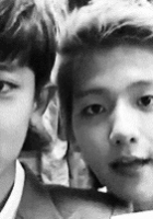
technique: [ 22 / 25 ] your technique is actually good already. there are only some things you need to note. look at this picture:

look at the circles that i numbered as number 1. you didn't cut the characters' pic neatly. there are still white glossy part that you haven't erased perfectly. in case of kai's pic, you're not erased the annoying part of his hair. and at number two, i think that on that part, there's too much white. just erase the whole white color that i've circled, the poster would look more great. all you need to do just be more thorough at cutting pictures. however, your blending skill is good already♡
resources: [ 7 / 10 ] the textures you used are good and matched with the theme. i love the flowery texture. but i don't like how you placed it. you placed it on the right side meanwhile, on the left side is too plain. it made your poster looked not balance. it would be better if you used flowery texture in both side. OR use another crowded texture in the left side, so your poster would look more balance. but other than that, your texture choices are good♡
typography: [ 14 / 15 ] your title font color is adorable. i love it. what annoyed me a bit is the title font. first time i read the title, i read the title; "forever" as "ForeDer", maybe it was just my eyes pmsl._. your quote placement and font are adorable. nothing to say♡
bonus: [ 3 / 5 ] i've seen many posters like this. but i love the overall feelings you've given the the viewer.
total points: 82/100 - adorable♡
tips for you: take a note of what i've said on coloring and technique. your graphic is great already, but it would be greater if you learn more more and more hehe. sorry for this late reviewTT_TT i'm currently busy with some real life things. hope this review will be helpful :)
-xoxo foxlight-
Comments