♡ asdfghjm15
silhouette • graphic review & tips {closed}Username: asdfghjm15
Experience: 10 months
Themes: mystery, supernatural/action
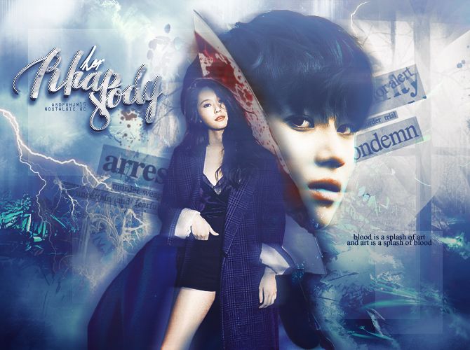
first impression: [ 8 / 10 ] what catched my eyes at the first time is the bloody knife. somehow, the placement of that knife is way too odd and too catchy. the second thing i catched is the characters pictures which are very good. the whole poster looks totally amazing except the knife. the font title is a bit disturbing my eyes, but besides, the font color is good. keep reading!
themes: [ 12 / 15 ] i should say that i really love the feelings you've given to the poster. but there's only a little thing you should note, first, the krystal's pic really not showing any supernatural, action, or mystery. but taemin really shows it, well i guess it would be more great if you change the krystal's picture. and second, (still) the knife. it's matched with the themes, but the placement is too pointy and odd. the colors difference with the background and the other things make it more odd. maybe you could change the knife into something.
coloring: [ 19 / 20 ] the coloring is totally excellent! the only thing i don't like and a little bit ruined the poster is the knife. it's way too dark. it would be better if you add more contrast and exposure. the blue color you used is amazing, but it would be more amazing if you use a darker blue to show more mystery feelings. i have nothing to say anymore, because actually your coloring technique is great already♡
technique: [ 23 / 25 ] your whole technique, i should say, that it's absolutely amazing! the poster looked so neat, and i really love your neatness. however, i found that around krystal's head there's a thin white line that you haven't erase/cut well. i also love the shadow effect, it is adorable! there's only a little problem with your technique, not really a problem actually, but it's just a bit annoyed my eyes. the krystal's pic you used only shows one leg. idk whether it's the original picture or not. but, letting the other leg being so bright while the other is not shown, makes krystal likes losing her one leg. other than that, your technique is absolutely neat and perfect♡
resources: [ 6 / 10 ] i don't like the knife, if i should say it again. it's too big, too odd, and the coloring makes it too dark. and it also covered taemin's cheek. half cheek. i actually don't know where we should put the knife so it would look better. i recommend you to change it with blood splashes. you can place the blood splashed around the title or behind the characters' pics. the textures for background are good. the text textures behind taestal's pic is a bit confusing at the first. i thought it was kind of quotes, but i realized it's textures, make it more blurry will make the poster looks totally better.
typography: [ 10 / 15 ] if i can read the title, i will give you a full points for the typography. but the reality is i can't. it's the only problem you have on typography, and sadly i should say it's the only and the biggest mistake on your typography. whole colors, quotes, placement, and others are good, except the title font choice. first i read it as "philiapody" then i was thinking what word is this then i should think twice when i finally found that it's "rhapsody". the "her" font is not noticable and too hard to read, maybe you can make it more bigger. other than that, your typography is amazing♡
bonus: [ 3 / 5 ] i don't like the knife, a lot. sorryTT_TT
total points: 81/100 - adorable♡
tips for you: take a note of what i've told you on typography and resources section♡♡♡ sorry for a late review.
-xoxo foxlight-
Comments