♡ petrabigail
silhouette • graphic review & tips {closed}Username: petrabigail
Experience: 1 year
Themes: romance

first impression: [ 8 / 10 ] your poster is actually beautiful. but i've seen many posters like this before, so i'm not really impressed at first sight. but somehow, i feel like this one have different feels. plus the coloring is very neat and great (i really love it tbh *^*) read on!
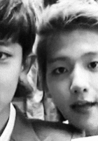
themes: [ 14 / 15 ] generally and obviously, your poster is romance themed. (if you confused with choosing genre, just take a look at the characters' expression / quotes / title. -bricked-) but it has slight angst too (you can see from the girl's expression and quotes). for romance themes, it's matched perfectly. the romance feelings shown from the colors you used. the only thing that annoyed my eyes is the girl on the right. why did her expression being so arrogant meanwhile the other pictures have shown saddy feelings. you could choose a picture which is like bowing her head down or her eyes looks to another side or her head and eyes look up. but other than that, there's no other flaws in this section♡
coloring: [ 20 / 20 ] oh my gosh, i should say that your coloring is perfect. the soft brown plus the pastel colors you attached are really great and matched with the theme. and also, the colors you used are balanced with each other. i can't give any critiques, only compliments. goodjob!♡
technique: [ 21 / 25 ] your technique is actually great already, especially your blending technique, it was so neat until i looked at the poster more careful. i found some miserased things. they might be invisible, but it would be more good if you erased it. first, the black weird thing behind the right-side-girl. is that texture or is it from the girl's original picture? but whatever is that, it's definitely ruined the poster. it would be great, if you delete that part. second, the girl's hair is passing through taemin's shoulder a bit. as you can see, there's part of the girl's hair slightly seen on taemin's shoulder, you can just delete that hair part. the last is white fog on taemin's clothes on the right side. same like before, you can just erase it. actually there's another thing that annoyed my eyes, blacky side behind both of taemin's pic. but i think it's okay, so i don't mind it. be more thorough at cutting picture or moving pictures, then your technique will absolutely perfect!
resources: [ 9 / 10 ] wow. i should say that your texture usings are perfectly matched with the theme. the textures you used are beautiful, soft, and have 'that feelings'. they're all also matched with characters pictures. there's only one thing that i don't really like; the papyrus paper or what-so-called paper around the poster. it's a bit odd right there. i think it would be better if you delete those textures and change with princessy texture such as crown or flowers or else, up to you. other than that, there's nothing to fixed on. goodjob!♡
typography: [ 13 / 15 ] your typography is beautiful. the font colors are what i really love the most. however, there are two things you need to take a note. first, the quotes placement is a bit too messy. i prefer a more arranged placement for this genre. second, the title font is so ordinary. but i think it's okay, just be more creative with the title font cause its what everyone's catched at the first sight.
bonus: [ 4 / 5 ] love the colorings so much and textures you used, very neat.
total points: 89/100 - magneficent♡
tips for you: congratulations for being featured! your poster is absolutely beautiful. you're so detailed and your poster is very neat!♡ no specific tips for you, just grow up more creativeness at making graphics. goodluck for the next graphic!
-xoxo foxlight-
Comments