tips 001♡

silhouette • graphic review & tips {closed}

HOW TO MAKE NON-HQ PIC INTO HQ PIC

dedicated to: wolveswifeu regarding to her question.


foreword: some people have problem with changing non high quality picture into the high quality one, ikr. me too tbh, sometimes i still have that problem. but i'm here just wanted to share how i make the non-hq pic into hq pic with my own way. it might not helping at all, but i'm trying T_T hope it's helpful.

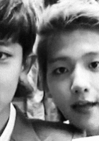
001. make a new canvas with a higher resolution (maybe 100+) open the picture and move to the canvas. (i used luhan's picture)

002. make the size bigger. when the size is bigger, the picture will look like noisy/broken, and being like a non high quality picture. (lol. what's the right word for this?) this canvas has been zoomed 200% to show you the broken/noisy part.

003. the first step to make it not broken/noisy or in another word, make it high-quality is turn down the brightness/exposure. (exposure: gamma correction to the right, arrange the pointer until his skin changed into dark brown.)

004. the second step is the brightness. make it more bright. tada, the broken/noisy part will got better than before. this is the result:

additional steps for more hq pic:

use topaz plugin (you can download and search for it on google)

005. use topaz clean and choose crisp style.

006. arrange the accent tool into '2'

007. click ok. 

008. add exposure again (move gamma correction to the right)

009. and the result will be like this:

before:

after brightness:

after topaz+exposure:

hope this simple tips would be helpful.

-xoxo foxlight-

Like this story? Give it an Upvote!
Thank you!
foxlight
i won't accept any reviews again since the college will start soon TT_TT i will update more tips later!

Comments

You must be logged in to comment
Poging_Yongguk #1
Chapter 24: Ah!!! Thank you so much!! Don't worry i will do what you said.I will try to make another one tha looks a bit the same as this poster.

I actually put luhan's pic lower than Yoona so that i will look like He's look at Yoona but at the same time he looks smaller than him XD....

Thank you so much for the Advice!! ^^
Poging_Yongguk #2
Chapter 19: By the way it's me the former Cokkie_bear

username : Poging_Yongguk

experience : almost 1 year

program: photoshop cs6

graphic link : http://i.imgur.com/LyWoSst.png

themes: romance and a bit sad

which part do you want me to more focus on? : Coloring and typography?

anything you wanted me to note: Thanks.... I'm Really not good in Typograpy,The Korean font are mess.(In my graphic)

password:Black
Poging_Yongguk #3
Chapter 19: Wow,Thanks for the Tips,It really help a lot.^^

Can i request for a Review again??....???
yuhsoul
#4
Chapter 20: Hey! Thanks for this tips omg useful! I will try it and show the result to you ;) Once again, thank you bcose u made this! idk u made this tips very faaaaasssttttt .___. thanks ♥♥♥
bottleofdreams
#5
Chapter 20: Omg, thanks for the review so much <33
The papyrus was supposed to show some royal princess-y like haha, but I guess it didn't match lol
For the black weird thing, do you mean the chair?
And for the hair I did notice it, and I've tried to erase, but oddly, it still visible. May you help me? T.T
Anyway, really thanks for the review, I may request again in the future ^^
sandeoki
#6
Chapter 2: username : asdfghjm15

experience : 10 months

program: photoshop cs6

graphic link : http://i1281.photobucket.com/albums/a505/asdfghjm15/taeminkrystal_zpsef59897e.jpg

themes: mystery, supernatural/action

which part do you want me to more focus on? : blending and technique?

anything you wanted me to note: first of all, thank you! i in typography...

password: transparent (?) loljk. black
yuhsoul
#7
Chapter 18: Hello, thank you for your review! I really like it <3 and yes, sometimes idk where should i put the quote even the title .___. and then, thank you if you wil make tips for something like this, i will read it and practice it! :D
Btw, i used yoona with this : http://snsdpics.com/wp-content/uploads/2011/08/yoona-innisfree-jeju-poster.jpg
and Luhan : http://i5.minus.com/ij0REWOqY5EUi.jpg
i think, that's why Luhan looks cracked. btw, i always play with adjustment like that, brightness, colow balance, and sometime curves but the result is really unexpected lol it became very dark and very bright. it's really hard hehehe
btw, thank you for the featured <3 feels so grateful here!
thank youuuuuuu! :D
Toilet_Paper
#8
Chapter 17: I don't think it's a must to do blending when doing a dark poster. just my opinion. there's so many blends in aff that most posters look like a copy of each other. i think you should've actually given her credit for trying out something new.