♡ se xing
silhouette • graphic review & tips {closed}Username: ing
Experience: +2 years
Themes: dark/angst
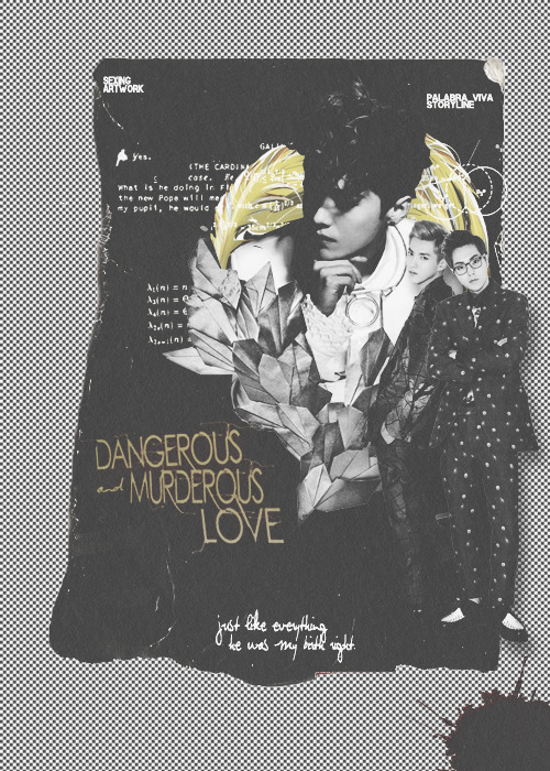
first impression: [ 8 / 10 ] i should say that i like the idea and the whole view. it's so so so much beautiful and elegantly sad. but i'm so sorry to say that the poster has no focus. i meant, there's too many things to catch up. everything is catching my eyes untill i cannot focus on what is actually your poster focus on? characters or typography or the textures. what's the strenght. that's what i'm not so understand at the end -bricked- but don't worry, your poster still beautiful, in its own way.
themes: [ 9 / 15 ] for the themes, dark? almost yes. angst? not really. why i said almost yes for dark theme? because your poster looked dark, but actually it isn't. for angst, i got the same feeling, your poster looked angst, but actually it isn't. first, i was confused, why this is happened. but finally i realized. your poster has a fancy/bit cute feelings -bricked- i don't really know why it would be happen, but i think because of the background you used and font choices on the title? TT_TT i'm really sorry to say this, but really you should remove those 'fancy things' to get both dark and angst feelings.
coloring: [ 18 / 20 ] your coloring skill is totally good. i don't mind with the yellow thing, because actually that's what makes your poster won't look so monotone. i think you used faded bw coloring for this poster? the ammount of faded coloring you used is too much on this poster. just make the opacity of fading later into 50% or so. and dark poster means texture skill. if you used black and white texture / desaturate, use many textures to make your poster dark or use colorful color, with simple texture. between that two things. however, your coloring skill is wonderful alr. keep it up♡
technique: [ 23 / 25 ] why your poster looked so fancy, i think because you didn't use blending technique majorly. dark means blending. as long as i can see, you only picked texture then attach it somewhere in the poster, not blend the texture into the background. it's not such a big problem since you really have a nice technique actually, you just need to grow up your creativity. and however, you need an effect for your poster. the effect you attached is way too plain, as i said before. shadows or something would be great. but other than that, your cutting skill, neatness, and character placement are great. keep it up♡
resources: [ 6 / 10 ] this is what you really need to improve. as i said before, dark angst means blending. blending here, could be blending texture. which on this poster, you didn't blend the textures but just attach them here and there. the text texture is kinda annoyed my eyes. it made the poster lost its focus. my recommendation is try to blend some dark textures ( i believe, you've known some good textures on deviantart ) or at least not attach the textures just like that. but other than that, the textures you used matched the themes well ( will matched perfectly if you add some another dark textures. or you can modify it to be not so fancy ) goodluck!
typography: [ 10 / 15 ] your font colors for both title and quote are great! i really love the colors you used. the typography placement is also great! however, the font is way too fancy and too plain. especially the title. i even didn't realize there's an "and" on that title if i hadn't focus on the title. my recommendation for the title font is felix titling. it's angsty elegant font that i usually use. but it's up to you, just in my opinion, your font is too fancy for dark poster. the quotes font is okay actually, but i can't read the quote. it's so crowded and unreadable (or is it my eyes? T_T) other than that, your typography is absolutely amazing♡
bonus: [ 3 / 5 ] your poster is fab♡ i never seen dark angst poster like this so yeah, i love the originality♡
total points: 76/100 - adorable♡
tips for you: take a note of what i've told you on coloring and resources section the most. and btw, sorry for this long review. i'm currently busy on my real lifeT_T hope you don't mind, and hope this review will be helpful.
-xoxo foxlight-
Comments