♡ 4everlittlemsfangirl
silhouette • graphic review & tips {closed}Username: 4everlittlemsfangirl
Experience: 1 year and 4 months
Themes: Angst

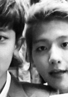
first impression: [ 7 / 10 ] hm. i'm between like and dislike when i saw your poster at the first time. i love how you placed the characters into the poster. but somehow, the picture and coloring you used annoyed my eyes. well, let me tell you more and their own section later. read on!
themes: [ 10 / 15 ] the theme you should do is angst. but somehow, i don't get the angst feelings on the poster. the bright yellow on the right side is what i dislike the most. it made the feelings faded. the poster shows me, well, i don't know actually, what kind of feelings that actually the poster showed me, since the angsty feels have faded away through that bright yellow. the only thing that shows angsty feelings onlt characters' expression and font. maybe you should fix this problem by take a note of what i will tell you on coloring section.
coloring: [ 12 / 20 ] your main problem is at the coloring. i'm so sorry to say, that you coloring is very odd at this poster TT_TT you used coloring square. you can see at your poster the square things that added different colorings in each box. the coloring squares that you used on the left side placed perfectly; not too odd and not too bright. but look at the right side. the yellow big box makes the character's face over brightness. i know that everyone might think it's fabulous and such an effect. but the effect is not on the right place and too much. once again, i'm sorry to said that TT_TT. all you need to do is just simply remove the bright yellow box on the right side and replace it with a more soft color. the poster will surely looked so much better.
technique: [ 24 / 25 ] other than the coloring technique, your overall technique is beautifully perfect. you placed the pictures perfectly. cutting and blending nothing to say, really. but i just wanted to let you know that the character picture on the right side is a bit too big (you expose her chubby cheek into the viewer and it's a bit annoying, pmsl.) it would be better if you make the picture on the right side smaller. your poster is very neat. goodjob!♡
resources: [ 10 / 10 ] eventhough the coloring of those textures are not really good, but the textures you chose are really adorable. you placed the textures slightly in some place. many people would not notice those textures, but without thouse textures your poster will be so plain, how you applied this on the poster makes me totally in love with your texture placement and usings. goodjob dear!♡
typography: [ 14 / 15 ] the font you used really matched with the themes. i really love it. plus, the modification you've made at the title, makes me amazed with your skill. there's nothing to improve, really. i just wanted to add an opinion, that maybe you should us a more clear font for the rest "eaven" because the lines on the box made me bit annoyed. hm, and move the whole title and credit bit to the bottom and to the right, so the typography won't be so close with the character's face. but other than that, your typography is beautiful♡
bonus: [ 3 / 5 ] i really don't like the coloring, i'm so sorryTT but other than, that your poster is beautiful♡
total points: 80/100 - adorable♡
tips for you: take note of what i've told you in coloring section. btw, sorry for this late review, and i hope i wasn't too harsh. hehe.
-xoxo foxlight-
Comments