♡ wolveswifeu
silhouette • graphic review & tips {closed}Username: wolveswifeu
Experience: 1 year
Themes: romance and a bit sad

first impression: [ 9 / 10 ] i don't know why, but i think your posters always have sweet feelings at first sight. like fluff-romance feelings, and i really love it. there's actually nothing to say here except compliments! there's only a few little things that you should fix. nothing big, really. read on!
themes: [ 14 / 15 ] your poster is perfectly matched with the themes. the romance feelings really there, everyone will surely feel it, because it's very obvious. the 'a bit sad' or slight angst feelings is there too. i guess, you used like bright angst idea for this poster? ( tell me if i was wrong -bricked- ) i really love that idea! it's beautifully applied on the poster. eventhough it's only slight angst, but you need to put 'not-so-happy' picture. i'm okay with luhan's pic. but maybe you should change yoona's pic. she's smiling too much -bricked- maybe you could change the picture when she's smiling not so big, just a thin smile or saddy smile. hope you got what i meant.
coloring: [ 19 / 20 ] the colors you used are so natural and sweet. the brightness of the poster is balance except the yoona's picture. her picture is too bright a bit. just a bit. make her layer brightness lower a bit, then her clothes wouldn't looked so shiny like that, haha. it goes same with the luhan's picture. however, every single color you put on the poster is beautiful♡
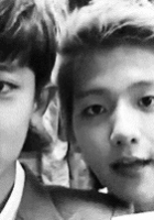
technique: [ 21 / 25 ] your technique, as i've said on the previous review, is very amazing. you did a picture manipulation, and the manipulation is almost perfect. however, there are some things you need to take a note. look at this picture:
 as i said on the previous review, you can't ever cut someone's picture on their ankle (like you did on the girl's picture; same case like the previous graphic. or you made this before the previous one? -bricked-) you can make yoona's position more lower. and now look at the circle around luhan's head. there's still whitey part that maybe you haven't erased. next, you can see obviously, yoona's picture is too clear meanwhile the background is too blurry, it really made yoona looks like 'only glued' not like she's there, do you got what i meant? all you can do is make the yoona's contrast more lower (i think it could work. but i don't think so since the background is way too blurry -bricked-) your last problem is going to luhan's picture. i think the picture is not really high quality at all (that's why you asked me this on request form?._.) maybe you resized the picture bit too much. i can't give the tips right here, since it would be so long. i will make a tips chapter soon. other than those things, your technique is very good, especially the blending one.
resources: [ 9 / 10 ] wow the background you chose is somehow really matched with yoona and luhan pictures. two thumbs up for you! your one and only problem is the picture is too blurry. i bet, the pic is originally like that? but it would be great if you chose a background with a more clear picture. i meant not until 100% clear. maybe 50%-60% is good already. the background you used is (i guess) around 30% blurred. however, the background you used is awesome already! that was just a small thing♡
typography: [ 13 / 15 ] you asked me about how your typography now. and i should answer with: totally amazing! it's really attractive and catchy. the feelings is really there. i'm totally in love with your whole font choices are very good and matched. there are only two things that i don't really like. first, the quotes placement. since the upper side of the poster really plain, why don't you place the quote there? (i've made the example of placing the quotes; look at the correction picture on the upper side.) and the second thing is the boxes that framed the quotes. the color you chose for the boxes are really a color-jump. too odd, if i should say. i recommend you to just delete the boxes or change the boxes colors into something more relating with the whole poster color. but other than that, your typography is totally amazing, like i've said before♡
bonus: [ 4 / 5 ] because your manipulation is very amazing! plus the originality♡
total points: 89/100 points - magneficent♡
tips for you: congratulations for being featured for the second time! woohoo, your graphic is beautiful♡ keep it up! you only need to be more thorough at making graphic:) regarding to your question about how to make a non-hq picture into hq, will make a tutorial tips about that soon. and about how to make two pictures look same, play with the curves/brightness until they got same brightness or use psd coloring. hope it'll help.
-xoxo foxlight-
Comments