♡ 4everlittlemsfangirl
silhouette • graphic review & tips {closed}Username: 4everlittlemsfangirl
Experience: 1 year and 4 months
Themes: angst, action, melodrama

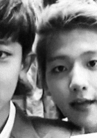
first impression: [ 9 / 10 ] first time i saw this poster, i could feel the strong feelings. beautifully made, neat, and the colorings is very good. however, the font is a bit annoyed my eyes. but besides, your poster is absolutely deserves an applause♡
themes: [ 10 / 15 ] i could feel the angst theme on both of the characters. but melodrama? i don't think so. maybe, both faces should be more sadden than this. melodrama means a so dramatic angsty, i think you know this right. (since almost everyone loves melodrama, pmsl) for action theme, i think this is what i didn't get the most. the coloring is okay for action theme but the background is too empty for action theme, and the characters position is too monotone for action theme. maybe drooping position would suit the best for action, angst, and also melodrama.
coloring: [ 20 / 20 ] i love the overall colorings. the brown-coffee color you used is representing action, angst, and melodarama in a very good way. nothing to say, you've done a very great job here♡
technique: [ 23 / 25 ] in this poster, i see you used a lot of blending technique, and all of blendings in this poster are very neat and adorable. for example, the colors you applied on the characters pic blended well, and the cream colored texture that overlayed on the character's body has applied beautifully. i have nothing to say actually. but i just realized that the cream colored texture you used around the man's hand is a bit too much. i think, it would be better if you blend the texture only until his body not until his hands. because if you compare with the texture that covered the girl's pic, the amount of the texture between the boy's and the girl's won't be balanced. (hope you got what i meant) and i also realized that the boy's pic is a little bit too big. just a little. maybe you just should make it smaller. but other than that, your technique is perfect♡
resources: [ 6 / 10 ] the background you used is way too plain for action genre. i think that's why your poster doesn't fit the action genre, because basically action genre need a more crowded poster (but not too crowded). bullet hole, blood splashes, or shard texture would be great.
typography: [ 14 / 15 ] your fonts choice is good and fit the themes perfectly. the colors you used are fit the genre too. however, there are some text that not so clear to be read. for example the "you" word on the title. the color it's too same with the texture. my recommendation is move the whole title to the girl's side. the title will surely more clear to be read if you move there. and the other font that not so clear is the quotes or credit or something in the top side of the poster. the font is too small, and the color makes me cannot read it. what is it actually, i still don't know -bricked- i recommend you to change the font color into dark brown, it would get better, i swear. but besides, your typography is so so so fabulous♡
bonus: [ 4 / 5 ] love the overall view♡
total points: 86/100 - magneficent♡
tips for you: woohoo! congrats you're being featured! no particular tips since your artwork is neat already, but try to match the theme with characters pictures more intense:D
-xoxo foxlight-
Comments