ChemicalLuvs
G◙ing Cr๑zy || Graphic Review [close]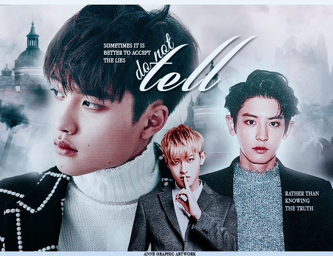
ChemicalLuvs
Detailed or Simple review: Detailed
Message/Purpose of Graphic: Keeping secrets from someone.
Your concerns, if any: Typography and usage of stocks. Could you give some tips on using stocks? I always had trouble using it because I cant find a good place to place it. Like this poster, the character fill up 3/4 of the poster without any stocks so I think it's a bit bland. And also characters placement. :)
FIRST GLANCE/IMPRESSION
It's a very nice and clean graphic, but I feel highly conflicted where my eyes should be focused on because the people on the right are staring straight at the audience and the person on the left is larger than the other two, which also tells me to pay attention to it. So depending who is the main cast here, I believe they should be the main focus of your graphic. Though judging by your title 'do not tell' I'd say the person most suited is the person in the middle. He's already staring at the audience but he has the least attention-grabbing vibe compared to the other two, who are larger in size and I'm assuming, the main couple.
I like how you made some attempt to change the typography by putting the words alongside the 't' of 'tell.' It's simple but definitely keeps the words interesting and readable. Although, since you've kept 'do not' connected with each letter, I believe you should do the same for 'tell' so the cursive may flow together in connectivity. Concering the purpose of using cursive most of the time is to put the letters together. If you use a different typeface other than cursive, then spacing may be more appropriate.
MOOD AND THEMES
I'm not really feeling much with their blank faces while the person in the middle is smiling. Concerning it's keeping a secret, I'd say the blankness goes well and that's how it should be. It's like having the urge to tell someone the truth through your eyes and asking them to believe them and I think that's really deep. You've really put a lot of consideration into choosing your images!
COLOR HARMONY
The colors suits the theme. The truth is vague and not so clear cut with colors and the dullness really shows that the answers are not so visible as black and white either. I like how you've given the two large images of the characters about the same color tone and stayed within the same color palettes.Also, the middle person's hair color sort of asks for attention as well. If I were to crop this with the title and the middle person, I'd say that's a nice graphic in itself too. Considering it stands a bit out the range of the color palette, it gives more focus on the title.
STOCK USESI think you're pretty good with the usage of stock as a background. It looks like fog in the back and that totally suits the title since 'do not tell' implies keeping your mouth shut, even though sometimes you might let out some of the truth despite keeping the secret. I can see why you would think it looks plain and is overpowered by the characters filling up the graphic. If you would like, you can put smoke texture over the characters. Since the concept has a vague truth in it. It could be like hiding the secret. If you would like to use something more solid, like the buildings in the background, you can put it behind the person in the middle so he may stand out more. Considering this is purely my opinion, but I think the person in the middle should stand out the most since he's holding the 'hush' pose, which also should be the main focus point because it illustrates the title perfectly. However, the fact that he's small and blends too much with the other two, it's hardly noticable. I suggest you either make him bigger or put some more stock/texture behind him and bring attention to him.
You also have a good judgement of placing characters around the graphic. It doesn't feel cluttered and they have enough space to breathe. If I were to place and resize them, I would scale the person in the middle so he is larger and place him on the right side instead. This is to even out the weight from the left side and the character, who is already larger than the other two photos. Also with his face and 'hush' pose next to the title, it brings attention to the words and allows the viewers to see the concept and make the connection with the title really easily. A title or word is best understood with the meaning of the words right next to the text and in the most obvious places. And with the middle person holding the concept, I think he could allow more awareness to the title.
If you're having trouble with choosing photos, you can always google/whatever search engine you use on the title and see what pictures appear with those words. It usually helps give you an idea of what pictures to fill up if you don't want to be redundant and use the same photos. Though, I think you've choose well for the person in the middle, however, I'd suggest resizing the the other two characters so they don't fill up too much of the graphic. Though I'm all for filling up the graphic with characters, even if it is plain. But that's just me.
TYPOGRAPHY
As I've said earlier, I like how you made 'do not tell' and how you should consider connecting the letters on 'tell.' I believe you've made the right decision when using cursive for the title because it really reminds me of the wind and thus, the air we breath with words and I think you've established that connection really well.Then, the quote on the left 'sometimes it is better to accept the lies' I think it is best to space it a bit more farther away from the title. It adds a lot more weight when it's next to another set of text and my eyes really want to pay attention to the large picture below the text, and as I had mentioned earlier, is already asking for the viewer's attention with the size. Even though I understand you're trying to put it over a contrasting surface and not ruin the image below with shadows (I'm amaze at how little there are), putting too many text next to each other confuses the viewer on what to read first. And since the quote comes first, I'm bothered to read it before the title, even if the title is larger. Therefore, please allow the text to breathe a little more.
Lastly, if you really want to go far and beyond (creative-wise), I'd say integrate the title with the middle person's 'hush' pose. Just the way his lips and finger look like a 't' or 'l', depending on how you want to use it, could be put together with letters. Remeber how people use celebrity nostrils for 'google'?
Yeah, this concept but I wouldn't recommend using their nostrils lol. Just play with the images.
SKILLS AND TECHNIQUES
It's extremely clean. You've paid attention to nearly everything and hide many things very well. There's almost always something sticking out when I look at someone's work, but I don't see an unrelated object relevant enough to point out. Except the top left corner, but that's very tiny and doesn't affect the graphic as a whole. There isn't a problem with the blending either and you've kept it within the same color range. Great job.
OVERALL
I'm sorry for the vague third-person perspective, but I'm terrible with name and faces. OTLI think this graphic is really something because the more I stare at it, the more I realize how much you've considered into making it. It's really amazing and I hope this review was helpful. :)


Comments