` ✼ MissyQ
` ✼ exotic grounds — graphic reviews
` ✼MissyQ
✼MissyQ
03.29.13
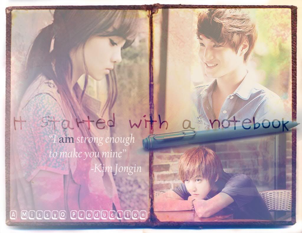
impression (12/20) - i found the poster extremely plain..
fonts and colors (14/20) - the colors are in great use. but i think you should use only 2-3 colors for a romancy poster. the foent.. I don't really like it as its really plain and you should play around with more fonts. i don't think you should use what you used for the credits.
textures/stocks (13/20) - they were too plain and i think you should blend more for a romancy poster.
pictures (20/25) - the pictures used were good,but its funny how the girl is sad while kai is like smiling and the boy under him has another different expression. You should try getting all of their faces have the same expression.
overall (8/15) - the overall appearance of your poster is not bad.. but its still too plain for me to look at.
bonus (2/5)
69/100!
this is reviewed by babycorn :)
Comments