` ✼ Pretty_Monkay
` ✼ exotic grounds — graphic reviews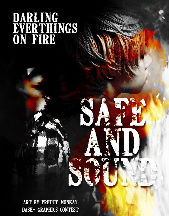
`✼PRETTY
MONKAY
02.20.13
impression (14/20) - i love how you made it really dark. it looks more of an action-themes poster, though.
fonts and colors (14/20) - i'm fine with the colors you used. the problem is that i don't like the font. you should have used a lighter font for the quotes.
textures/stocks (16/20) - good job on using the stock. it suits the theme well.
pictures (22/25) - i can't really see the person at the left. but i can tell that you used pretty good pictures.
overall (11/15) - overall, it's okay. but it doesn't convey the theme effectively. i've noticed that once the theme is angst, most of the designers pick dark colors. it's okay, but avoid associating it with red. it'll look like an action or maybe gory poster. anyways, good job.
bonus (2/5)
79/100!
Comments