shineecrazed
Corner to Corner Graphic Reviews
 l
l
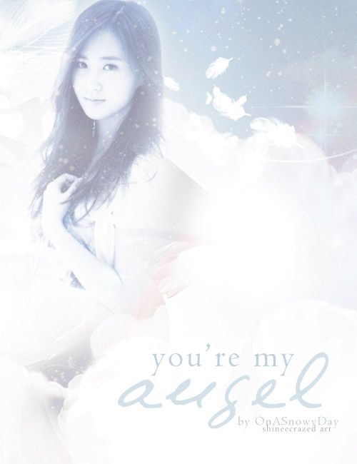
First look: The poster is really blue. First time glancing at it, it looks a bit low quality to me, because of the blue hue to the poster, and the white splatters also added to the LQ look. This poster gives me an okay impression. There’s not much to look at because it’s fairly simple. Even though it’s simple I do really love the details you put into it. I love the feathers in the poster; it helps emphasize the title which is very clever! (8.5/10)
Photos: Yuri’s photo is a great choice. That photo really does fit the light theme of your poster, her subtle smile and her graceful pose is a very nice touch. I really like the position of her arm because it gives the overall photo a graceful feel which helps compliment your theme. The photo is HQ but you should sharpen it a bit to enhance the photo, it’s a bit blurry. (12/15)
Mood/theme: Looking at the poster, I can tell right away that the mood/theme is of light romance. You did an excellent job capturing your mood/theme. Once again the photo you chose really helped set the mood, the light blue and white helped set the theme. This section you did very well in, which may be your strongest part in designing! The little details you put into the graphics really helped bring out the mood/theme as well, the feathers and a soft touch of purple really brought the mood/theme out! Nice job. (15/15)
Blending/Cropping: Your blending is good but you can improve some. As you look at the poster you can see part of Yuri’s arm missing. Either you erased too much or blended too much off. Make sure to look out for that kind of stuff in your graphics. Since you blended her arm too much you could either re-blend or cover her arm with the white texture you used. Aside from her arm missing, your blending is good. (8/10)
Resources: I can spot about 4 textures; you used a lot of white textures which is great. The feather texture is also very well used. Your usage of textures is very good, you know how to use them and know your limit with texture usage. The textures you used really helped enhance the mood/theme of your poster. Looking at the poster, you either used a psd or colored the poster yourself. Looking at Yuri I can tell that you desaturaed her before adding all the textures and psd. It would be a lot better if you did not desaturate her, since you did that it looks a bit dull and she blends too much into the bg. She should be a different color so she won’t look as if she is part of the BG. Your texture usage is great but your coloring needs more work. Next time it would be better to not desaturate your photo and make sure to avoid overusing your psds because it makes the poster look over processed, making the characters have a weird hued skin tone. (9.5/20)
Composition: The text shouldn’t be placed on the lower right, instead it should be in the middle right, or it would look better if it was by Yuri’s elbow. To me the title placement seems really awkward, if it was placed by her elbow it would give your poster more movement and it’ll look better. I feel that the text placement is really awkward. (6/10)
Fonts: The fonts used could be a lot better. I’m not in favor with the texts you used for the poster. The poster is very light and it has an elegant feel to it but the fonts you chose are not elegant what so ever. It’s nice that you used two different fonts for your poster but you could have chosen better fonts. In my opinion, if you used the credit text for “You’re my” would look a lot better, and if you used a better script font for angel it would look 10x better. The colors of your fonts is good, you just need to work on the choice of fonts. The sub texts are great though. (2/5)
Quality: The poster is appealing; the overall look of the poster is very nice, and soft. It seems like a lot of time and effort has been put into it. The poster is very nice, it would look even better if you sharpened the poster to give it a more HQ look. (13/15)
Side Comments: Hey, thanks for waiting for your review. I hope this review helped you some. I tried to help you with resources since that was the section you wanted most help on so I hope after reading this you can improve!
Comments