Creamysmiles
Corner to Corner Graphic Reviews
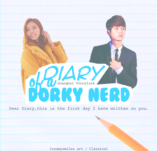
First look: The poster is smaller than others I’ve seen around on AFF. The poster doesn’t really leave any impact on me, it’s quite simple. The characters are nicely cut though! The thing that caught my attention was your choice of font, the fonts aren’t really attractive, nor does it match the overall poster. Also, the coloring of your characters is very different which gives me a negative feel for the poster. I think it’s a simple poster, it’s nice but it’s on the simple side, there could have been more on the poster, maybe some more pngs, or it would have been nice to see the characters on a white piece of paper on the posters’ bg to emphasize the concept, rather than making the whole poster a paper, If you understand what I’m getting at…All I’m trying to say is, that it would be nice to see more pngs used and more creativity for this poster. (5/10)
Photos: The photos do not really represent the mood/theme you stated, which is happy/cute. Myungsoo’s photo does not show happiness or cuteness, he seems a bit cold, maybe it’s his character’s personality but I think you could have used a different photo of him, rather using a cold photo of him, it would be better to use a photo where he is neutral, or even use a photo with a hint of a smile to help bring the mood/theme to life. The OC’s photo is good; she has a bright smile which does tie in with the mood/theme. My only problem with the photos you chose is the differences in the quality. The girl’s skin tone is really red, (did you use an edited photo?) while Myungsoo is brighter. He has a red hue to him but the OC is over the top with the red, it would be great if you erased some of the psd from the OC’s photo so she won’t look so over processed. Oh and also, something that caught my attention. The clothing of the OC does not match the poster; she has a very heavy jacket while Myungsoo is in a suit. Choosing photos, the things you need to look at are the expressions they wear, the quality in comparison AND the clothing they have. You always want to make sure that the photos you chose connects with one another to make it seem as if they belong together. The OC is an ulzzang which means she has a lot of photos to choose from. I don’t know why you chose that specific photo but it would be very great if you chose a different photo of her. This section needs more improvements! Just remember to look at the expressions, quality, and clothing for your future graphics! (4.5/15)
Mood/theme: Looking at the poster I could sense the happy/cute mood. The light blue really brings out the mood/theme of the poster. (15/15)
Blending/Cropping: The cropping was well done. I don’t see any rough cutting/edges. (10/10)
Resources: I see one texture which is the line texture used on the bg of the poster. I can also see the psd which you did not use correctly. I believe you over used the psd in this poster. The psd you chose made the characters look over processed, because of their unnatural skin tones which in my eyes, brought the quality of the poster down. Usually when designers use their psd’s they tend to overuse them and make their posters look over processed. It would be better if you lowered the color selection especially the red in the poster. Next time be careful when using psds, you can always edit the premade psds if you use them. Aside from textures and psds, I can see that you used a png/stock photo which is great! I like the pencil you included in the poster, it does help set the theme of the poster, and the pencil is great, it would be better if you added a diary of some sort to enhance the theme but it’s no big deal. (14/20)
Composition: The placement of your photos are fine, they’re centered which isn’t a crime but it would be cool if the characters were placed some other place, maybe more to the right and have your characters closer to one another. The title is placed nicely. The pencil is also good. (10/10)
Fonts: I really dislike the fonts, yes bubbly fonts goes great with your mood/theme of poster, but you did not use it correctly. You used 3 different fonts which are clever but the choice of the fonts does not go well with each other. Usually typography is weak points for most designers, so I understand if it’s hard. I myself would have a lot of trouble with fonts if I designed. The fonts you chose could be improved maybe you could have just gone with the bubbly font for “Dorky Nerd” for the whole title. The font for your subtext is good, no complaints! (2/5)
Quality: To be honest, I don’t really think much time was put into the poster because it is very simple and plain, but it is useable. The cutting is very nice, the blues you chose does well for the poster, just work on the font and photos for future graphics. I think this poster is nice but it could be better! (11/15)
Side Comments: I’ve actually seen some of your different work and I can say that you have improved a lot and I think you’ll only get better from here on. Just keep practicing and work harder!
TOTAL: 56.5
____________________________________________________________________
Reminder: Since I took my time reviewing your work, please take your time to leave me feedback! I want long and helpful feedbacks so I can be a better reviewer for future requestors! And remember the score given does not matter as much as the tips given.
Comments