missinfinity
Banana and Elephant ► Graphic Review Shop [Close]
First Impression (5.5/10)
It looks okay. You know what I mean? It's not bad but it's good either although I see potential in you. The poster looks like something I would have passed on.
Mood/Genre (8.5/10)
The mood of the story that you're trying to convey. The expressions on their faces is very good, I like your choice of pictures. They helped on supporting the mood of the story. Well done. If you would have made the poster black and white, it would have portrayed the mood better.
Technique (14/20)
You did not used blending or cutting which is refreshing to see in an angst poster but a little blending would have helped enhancing the poster. It seems like you only used little effort on making the poster but I do think that it suited the poster okay.
Pictures (4/5)
I like the pictures you used on the poster. Like I said before, the photos you used and the expression on the character's faces helped in conveying the mood of the poster well. Although if it was me, I would have picked another picture of Baek Sumin.
Quality (2.5/5)
The quality of the poster is all right (but more on the low side), but the quality of the pictures are low. smart sharpened would have helped. Here's the result if you smart sharpened it (radius: 0.2, amount: 500): 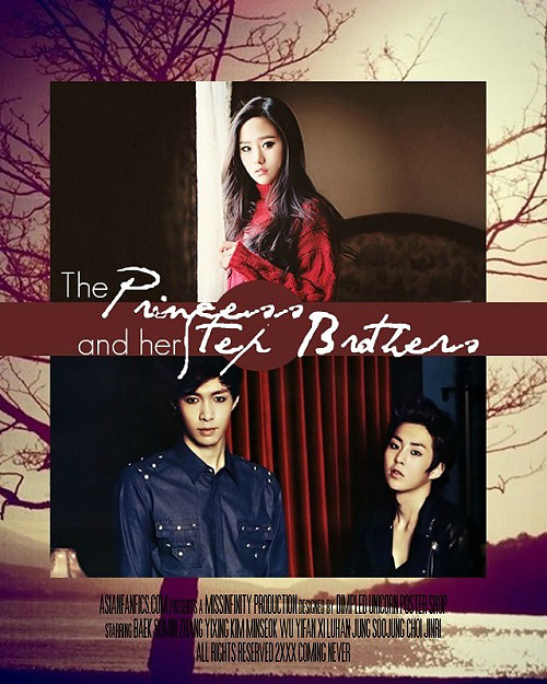
Coloring (7.5/10)
I don't like the purple hues on the background. I think it didn't compliment the poster as a whole. I don't think the poster was colored, it looks boring and bland without a coloring. A PSD would have helped make it better. A 3D effect wouldn't be bad too. I used a PSD and here's the result: 
Placement (13/15)
The poster don't look messy so props for that. You should have used separate photo each of Lay and Xiumin but I get why you only used one picture, it's because they are brothers, right?
I don't think the movie credits was necessary and instead of that, I would have the quotes or textures.
Resources (8/15)
There's not much of resources you used but some textures would have helped - like birds or geometric shapes. There are also textures that would contribute to the coloring of the poster. I applied some textures on the poster (and i applied it badly, mind you): 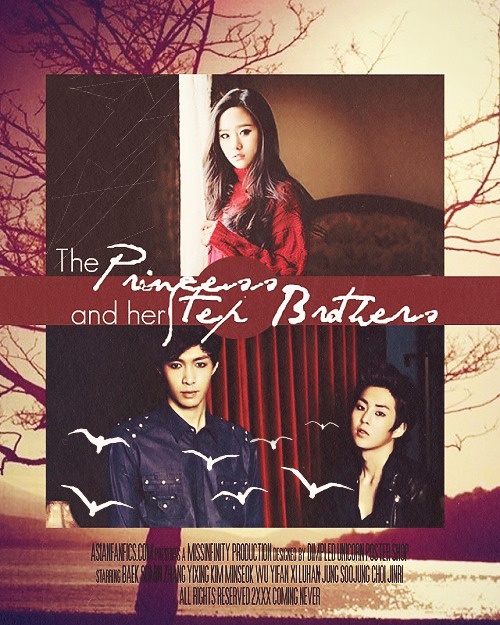
Typography (2/5)
I don't like the fonts you used. I like where they were placed but the 'Princess' and 'Step Brothers' can't be read that clearly, especially the 'step'. I suggest you use something like 'Respective' or 'English.' You cans each them up. And the simpler font you used, I think Times New Roman or Georgia would have done a better job.
Bonus (5/5)
Yay! My second review. I hope it helped you a lot. I at explaining things but I hope you understand. Also, the story sounds interesting. I hope I wasn't too harsh. By the way, I made my own version of your poster but used a different picture of Sumin though: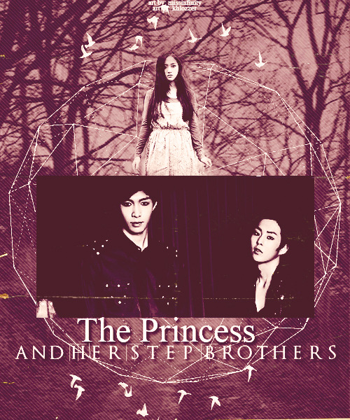
Total: 70/100
Reviewed by: khlozzer
Comments