SkyBluePlains
Banana and Elephant ► Graphic Review Shop [Close]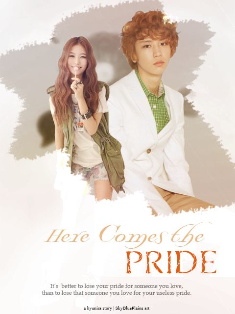
First Impression (6/10)
It looks simple, very very simple. It could be a good thing or a bad thing but the first thing that came into my mind was 'simple'. It also looks clean and bland and boring. Some colors would have helped making the poster better.
Mood/Genre (7/10)
You said that the genre of the story for the poster is romance right? I guess you did hit the genre but then I don't know what kind of romance. I can't tell if it's a fluff/cute type of romance or the angst type of romance. Due to the lack of colors and to the simplicity, my mind decided it's an angsty poster but then...the smiling girl made me want to think it's a cute type of poster and well, if you're trying to hit somewhere in between, well you did a good job.
Technique (16.5/20)
I see nothing wrong with the cutting/rendering of the pictures of the characters except for some white lines and some jagged lines but it wasn't that noticeable.
Pictures (3/5)
I think the picture you used for the story are...unsuitable. I actually checked the story and thank God, I have enough Tagalog skills to understand the story. I found out that it was the girl who's proud, not Chanyeol, so why not try to choose a picture of the girl where she has a neutral expression on and a smiling Chanyeol.
Quality (3/5)
The quality of the poster is okay, not blurred but not sharpened either. Try smart sharpening it. It might help.
Coloring (6/10)
I don't like the colors you used on the poster. Instead of dirty white on the background, why not blue? Blue compliments with orange well. And try a bolder shade of orange in 'Here Comes The'. I also don't like the gray color on Chanyeol and the girl's background - it gives off the wrong vibe.
Placement (12/15)
The characters, quotes and credits are well-placed. As for the title, Since everything is on the center, make the title on the center too to make it consistent. 'Here Comes The' should have been bigger.
Resources (8/15)
There's not much of resources you used, I think. I don't like the brush that you used on Chanyeol and the girl. I think it's not suitable on your poster. Instead of that brush, try placing them traditionally in a circle or a heart or a square might work too.
Typography (2.5/5)
The fonts you used are downright simple - everything in your poster is simple and they said that 'simplicity is the best form of sophistication' or something and I agree but sometimes, it's not bad to experiment and be playful. In your title, try using a bolder and wider font. The credits shouldn't have been black but gray like your quotes to be consistent on your poster.
Bonus (5/5)
Uhm yay! I hope you find this review helpful. Thank you for requesting from us. I do not intend to discourage people - think of this as a motivation to be better (I told someone this once and she unsubbed in my shop otl). Please do not unsub TT_TT
Total: 69/100
Reviewed by: khlozzer
Comments